THE WORLD IS BEAUTIFUL
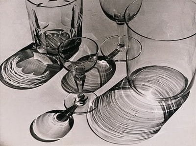
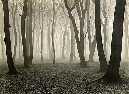
In 1928 Albert Renger-Patzsch published a photo book titled The World Is Beautiful, the book was a compilation of seemingly bleak images. What set this book apart from an average photo book is that it showed a realistic view of a post World War One society, Patzsch's work was an example of the new wave of artists during the Weimar Republic, the 100 images collected in his book featured pictures of industrial buildings and natural forms. He felt that through his photography he could capture the texture and essence of an object.
'TALLIS IS BEAUTIFUL'
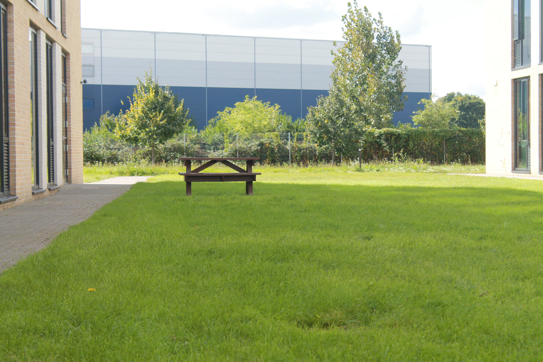
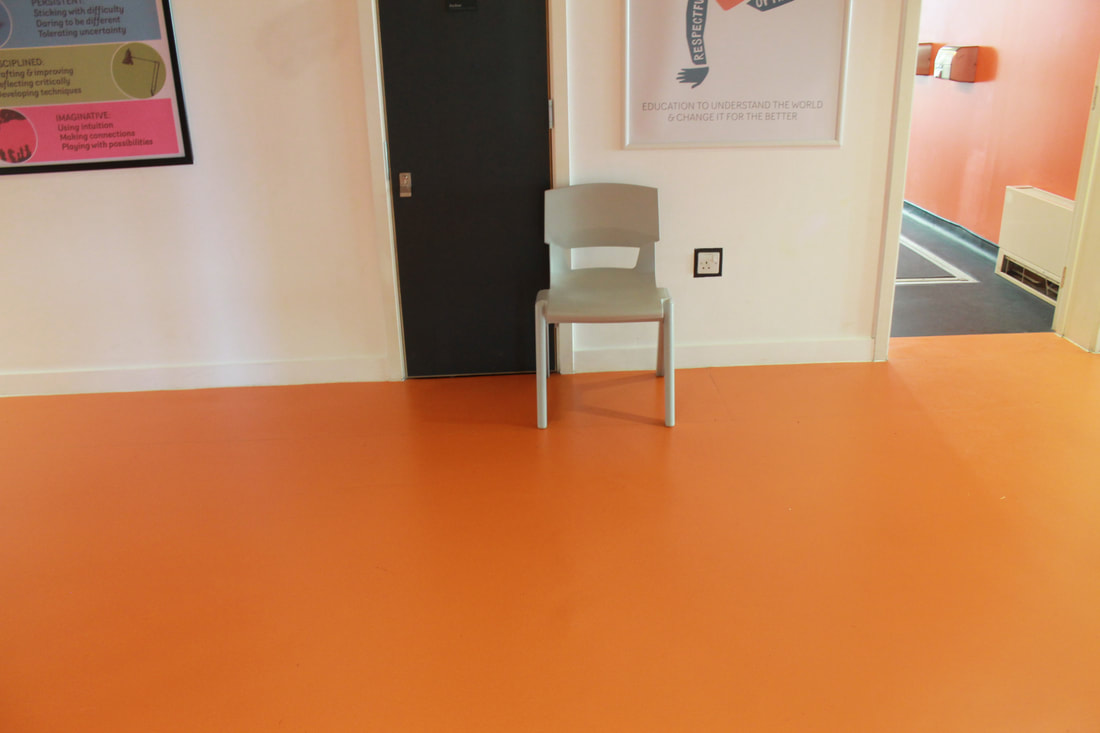
We were given the task to re create the works of Patzsch in the grounds of Tallis, we were told to photograph seemingly ordinary parts of the school without trying to make it overly artistic.
|
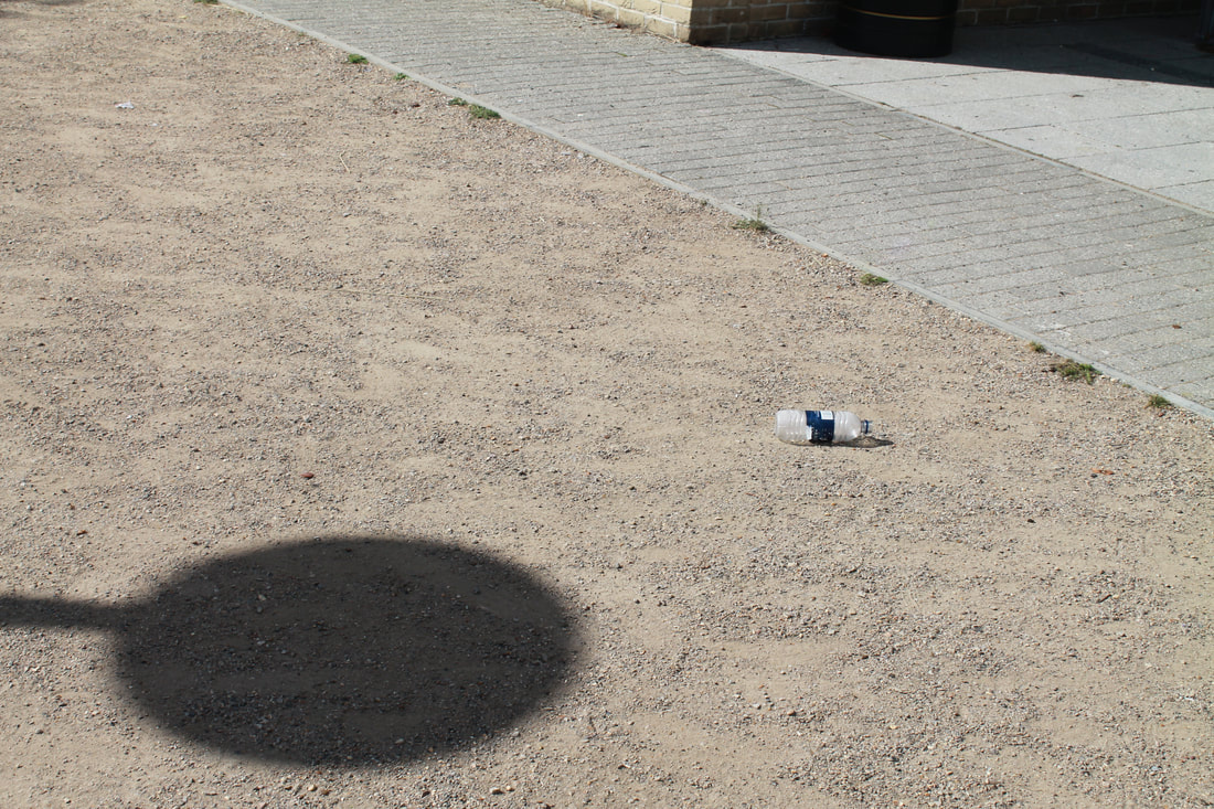
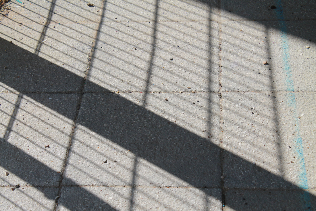
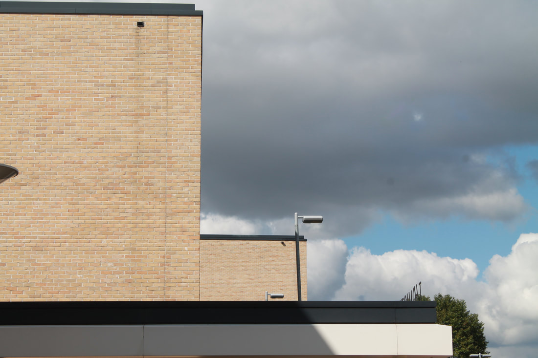
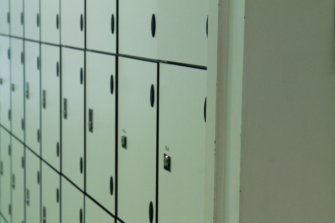
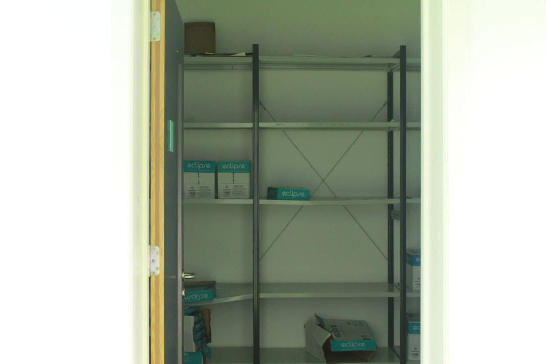
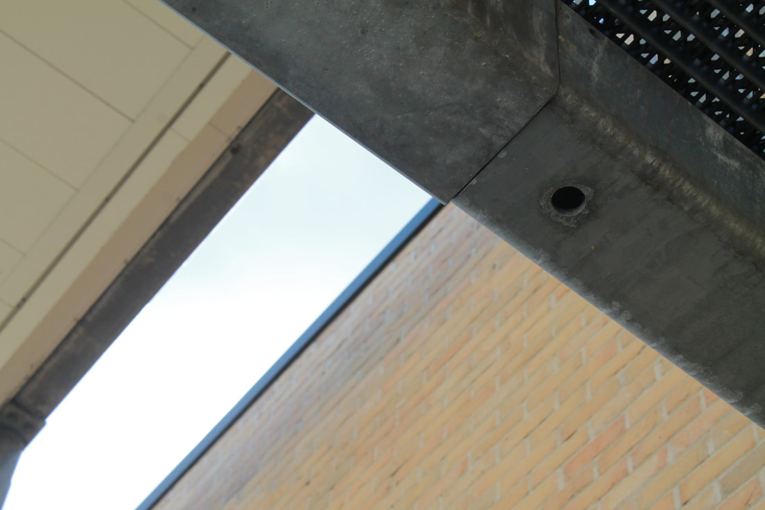
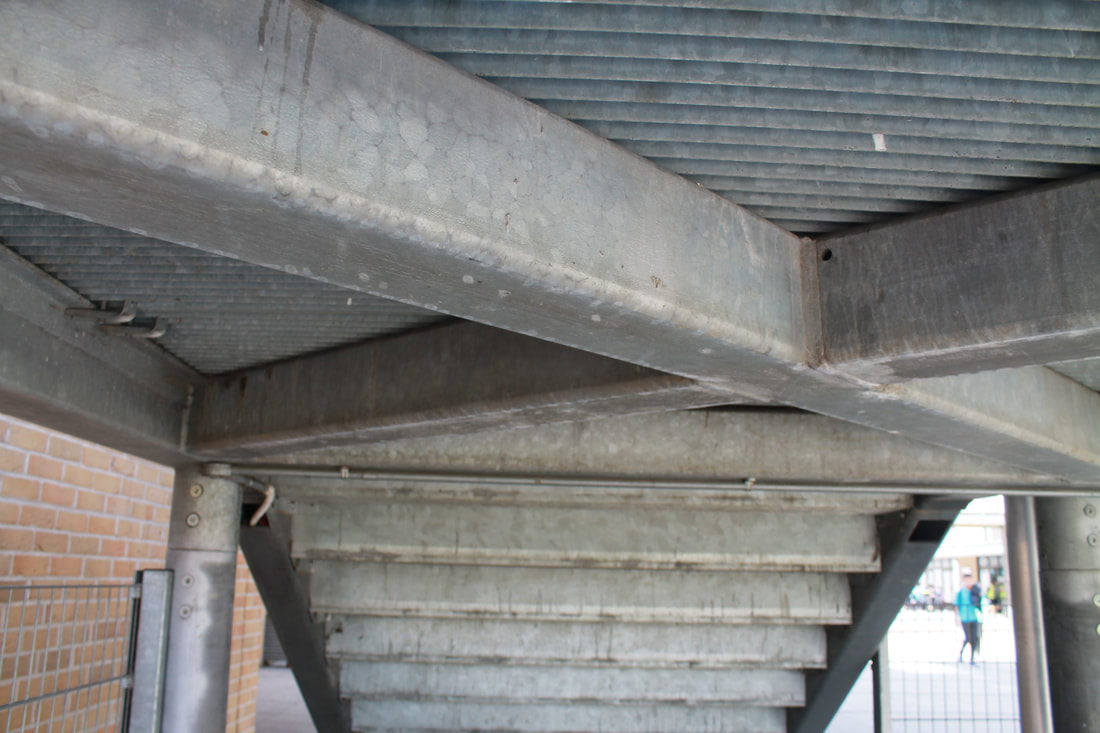
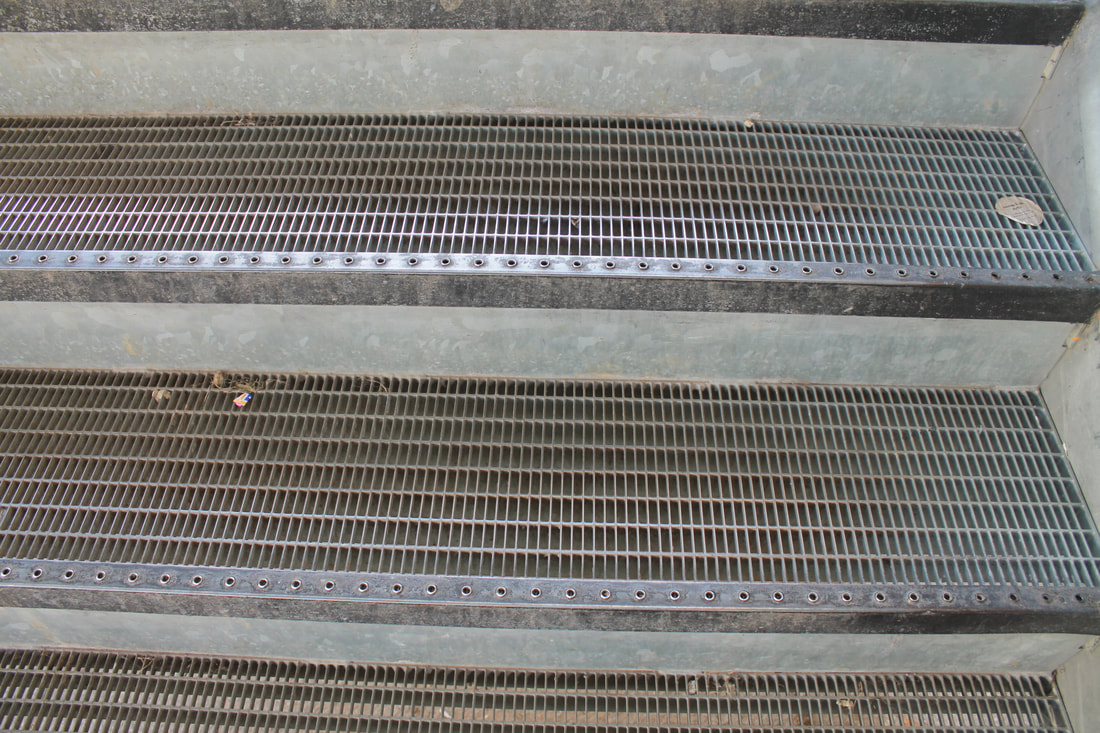
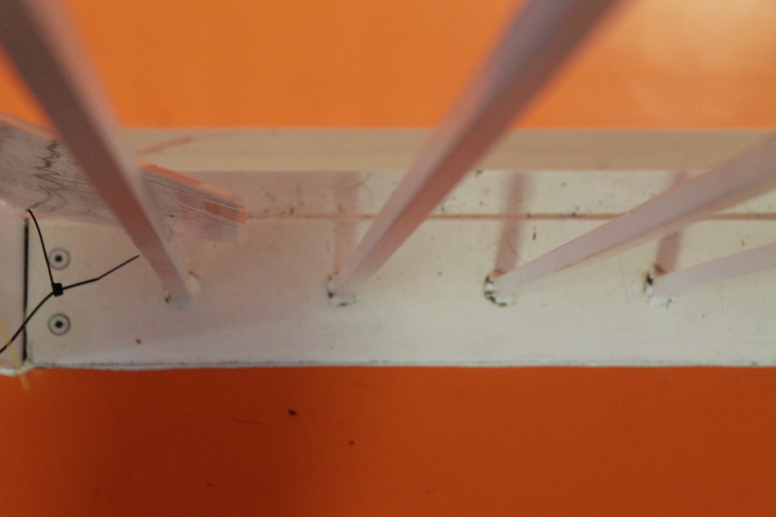
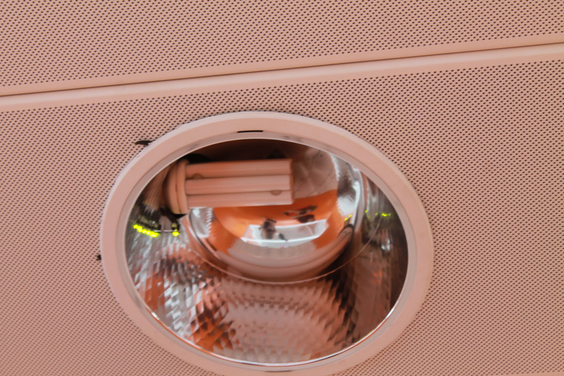
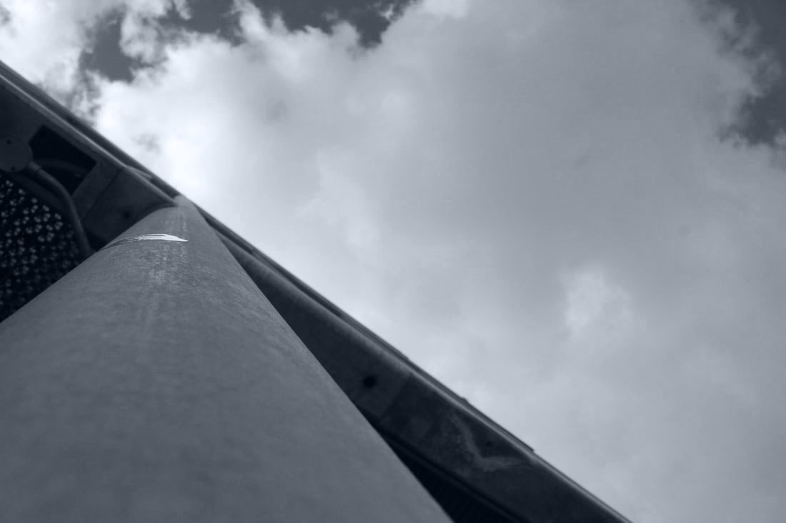
Here are my first set of images as a response to 'The World Is Beautiful', I took 34 images that I felt reflected the works of Patzsch. The criteria that I used to select the images included looking for lines and shadow. I also took the photos objectivly and purely focused on looking at the objects for what they really are. When I took this set of photographs it was sunny, this caused there to be lots of shadows all around the school, this made me think about the objects that initially cast the imprint. Here is my favourite image out the selection. 
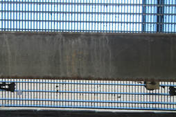
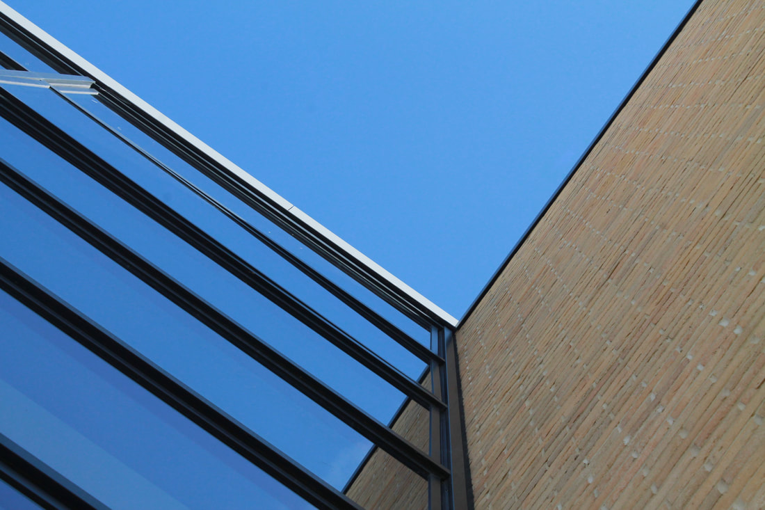
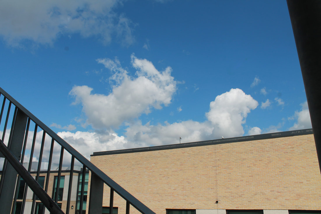
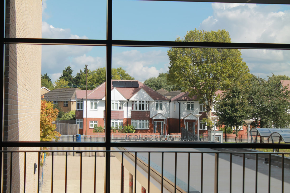
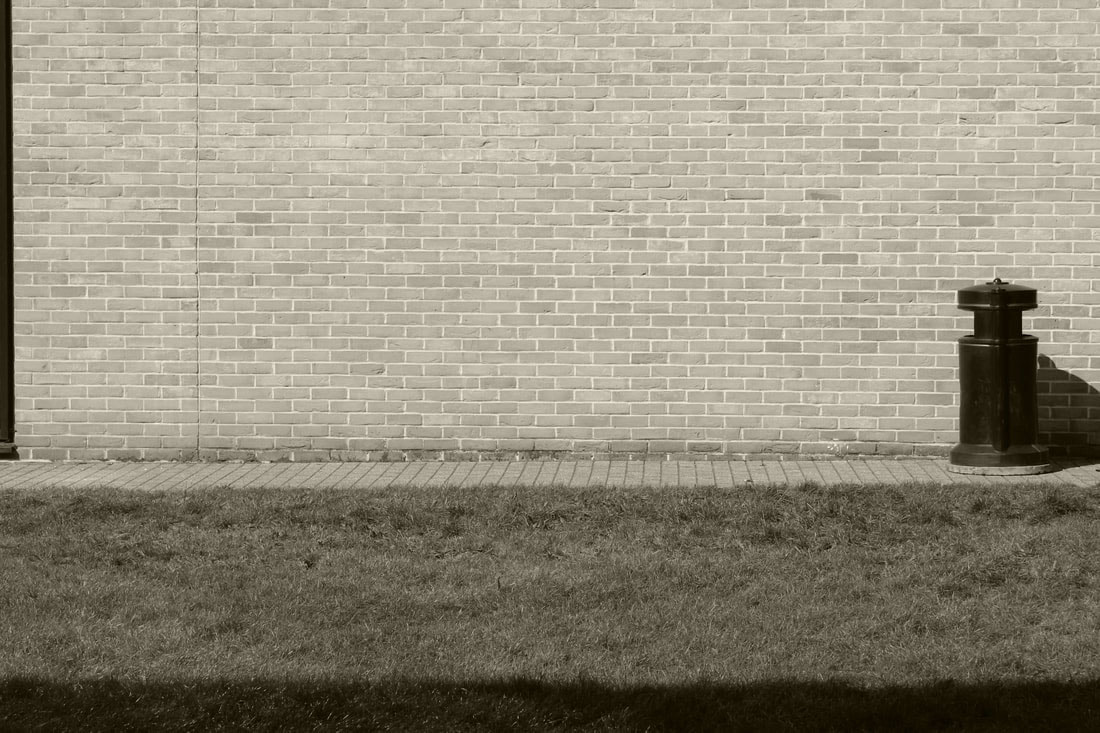
I am drawn to this image because of the deep royal blue of the sky and the straight line that continues from the building into its reflection, I feel that this photo is beautiful. I composed the image so that there would be a grid like effect, the result of the grid created the illusion that half the image is blue.
|
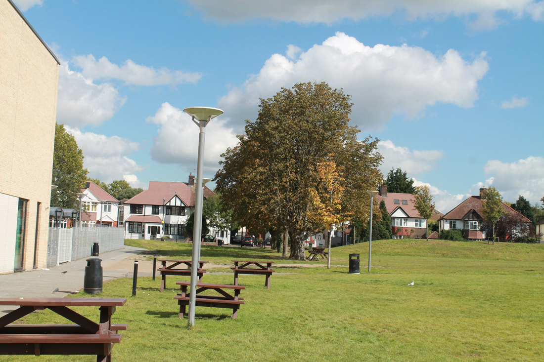
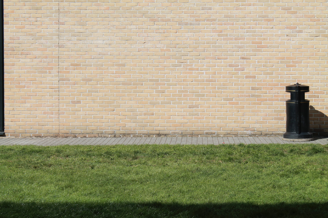
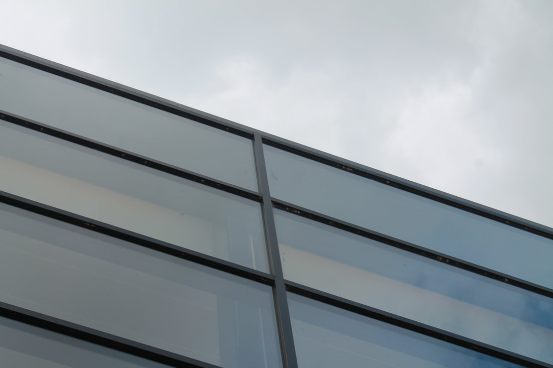
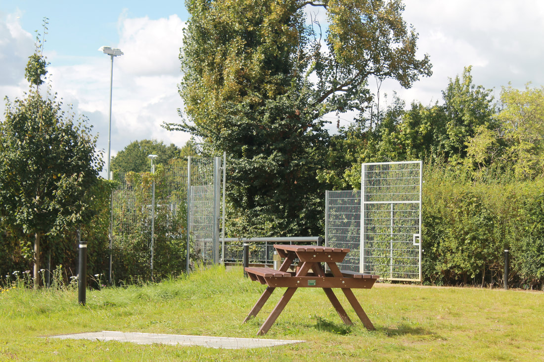
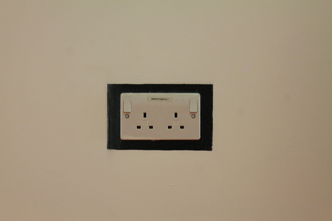
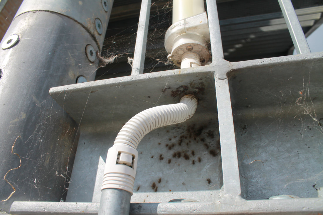
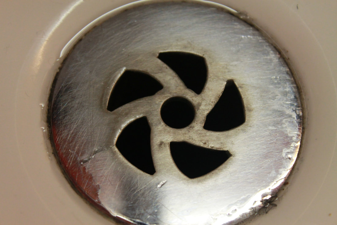
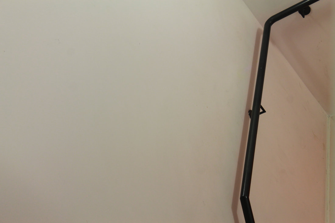
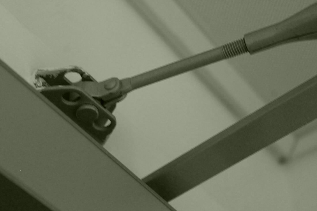
This image worked less well and is my least favourite out of my 34 photographs. The concept behind the image could of been executed far better, my issue with the image is how I poorly composed the object, aside from the slightly tilted framing I also dislike the content within the image, I personally find it bland and boring. To improve it I could of taken the image from a different angle, this would make it better because it would become less abstract and would fit the brief better.
|


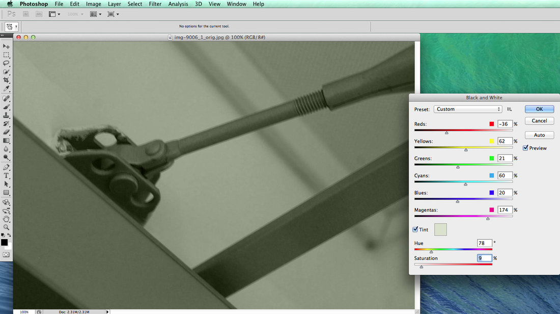
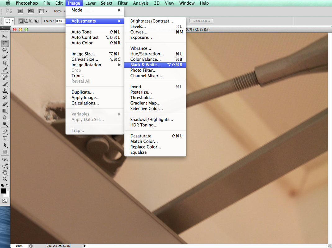
EDITING THE IMAGES
The original images from Patzsch's book are black and white, this makes the images appear spooky and shows a sign of the times from the era in which they were taken.
I used photoshop to create a similar effect on a few of the images from my contact sheet.
I used photoshop to create a similar effect on a few of the images from my contact sheet.
|
|
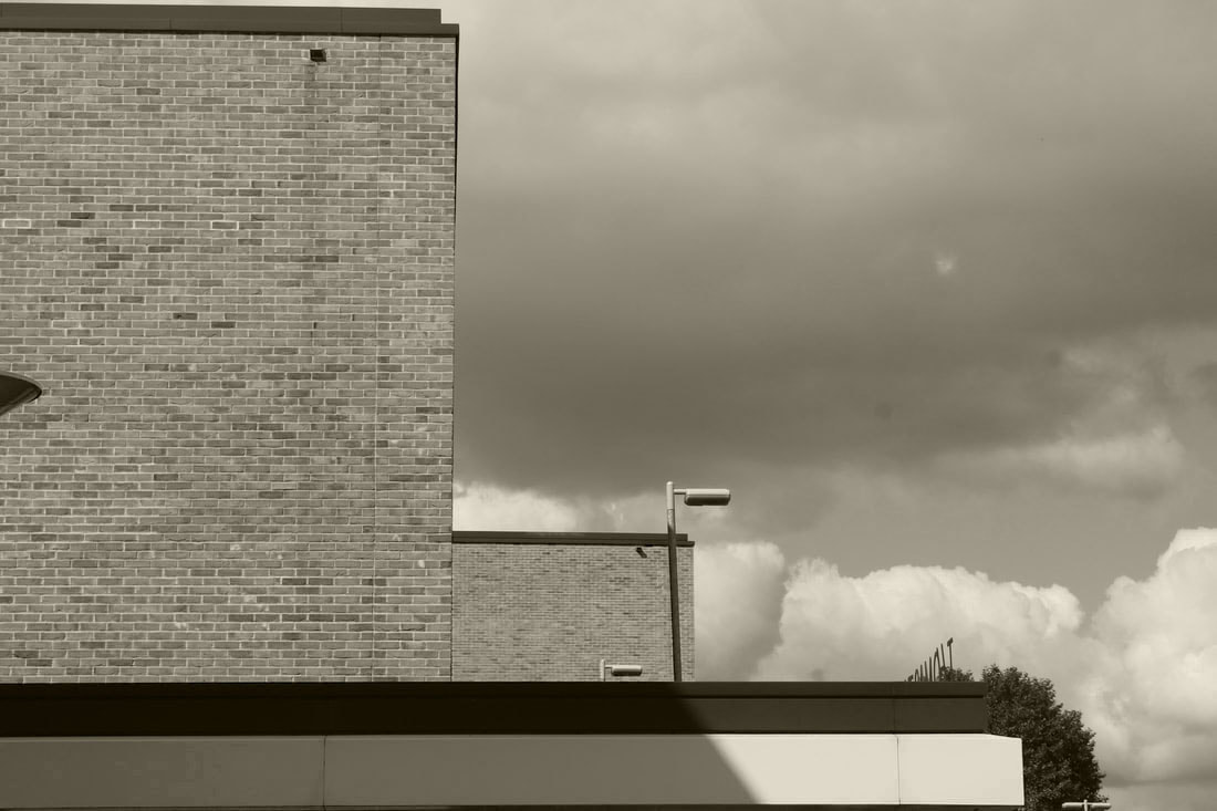
In photoshop I adjusted the colour levels of the black and white images, I added tints of reds and blues, this results in the image having a vintage look that reflects the images from the stimulus.
My favourite of the four images is the third image, I am drawn to this specific image because of the parallel lines of the buildings, also the result of experimenting with the colour levels allowed the clouds to appear heavy. |