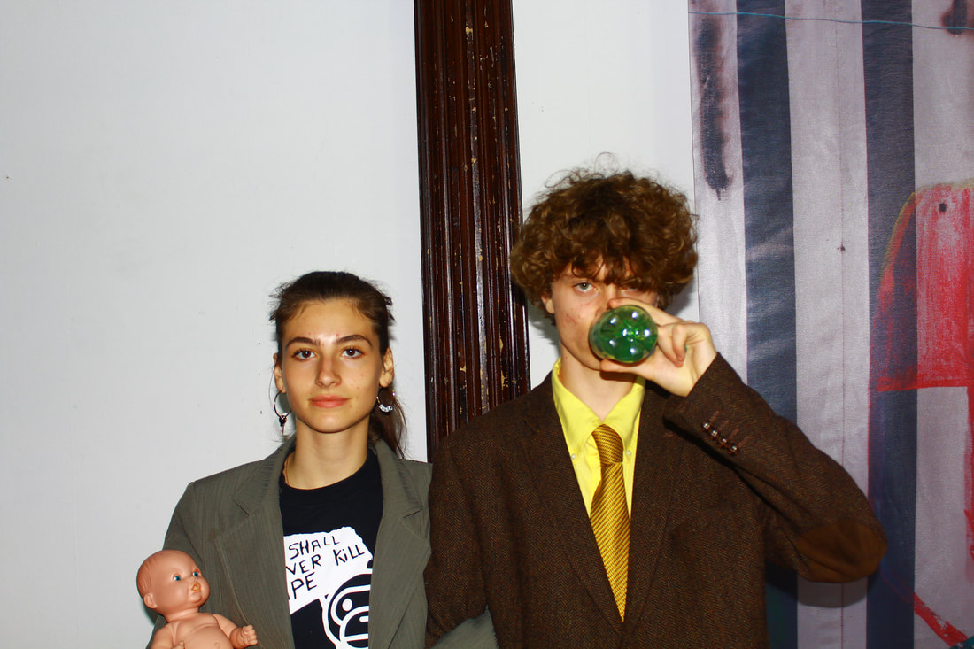
ME AS AN ARTIST
As an artist I feel that I work best when I am able to explore as many different art forms as possible. Currently my portfolio of creative paths include Photography, Music, Fashion design and Musician creative direction. The subjects of my photographs are often my peers and fellow creatives, I photograph with the goal of capturing as many important moments concerning our respective creative path ways. I would define my work as intentionally rough and raw, I prefer to capture real moments without staging.
I draw my inspirations from a manner of different places and I often find my vision shifting from person to person and platform to platform. At the time of writing this I am most inspired by "STRAY RATS" brand creator and designer Julian Consuegra, DJ, designer and creative power house Tremaine Emroy and British photographer Derek Ridgers. During this investigation I want to explore the ways I can tie in all of the different avenues I find interesting and if by compiling them there will be an even larger emotional release.
Due to the way multiple fields that I create in it is hard to pin down one specific thing that I would want to investigate, it would be hard for me to even begin to choose which path to take, because of this I feel as if the most honest representation of my craft would be to investigate how to bring my photography, design and music together into one immersive product, to me this would be far more interesting than just creating one piece from one type of field, my first step in this investigation is to develop an initial idea.
START OF THE INVESTIGATION - INSPIRATIONS
|
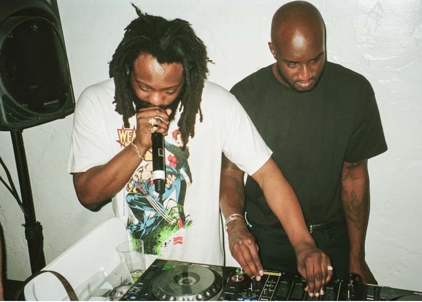
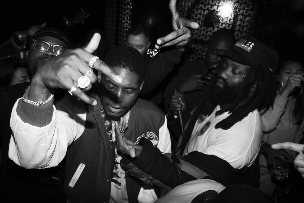
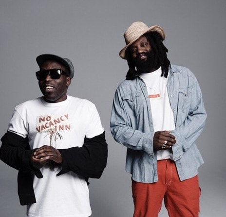
NO VACANCY INN
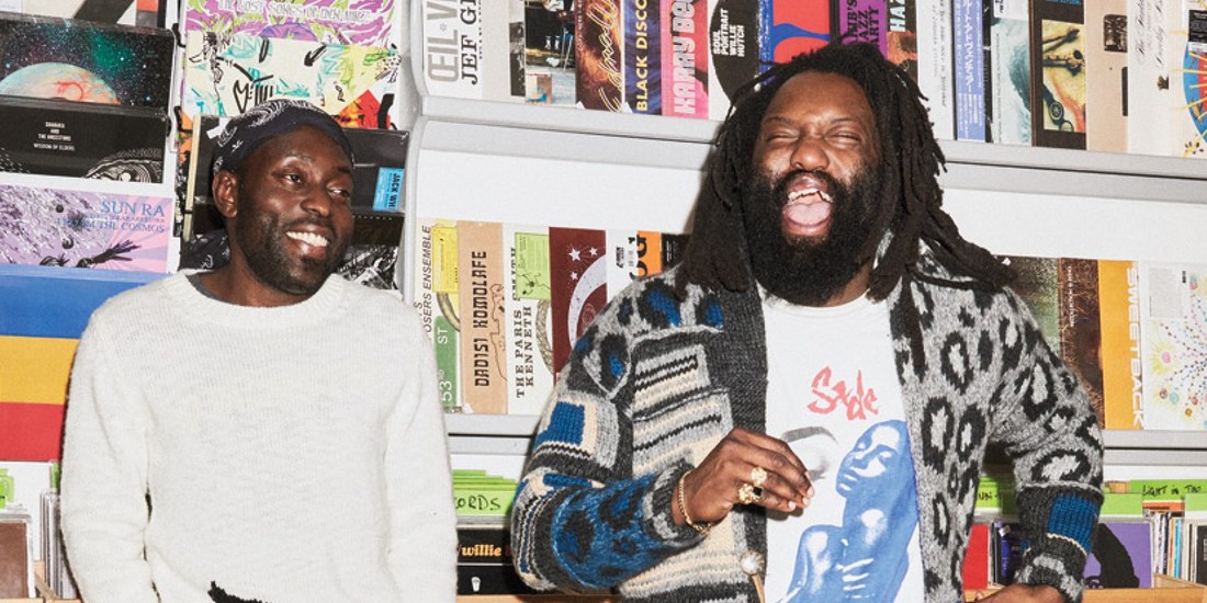
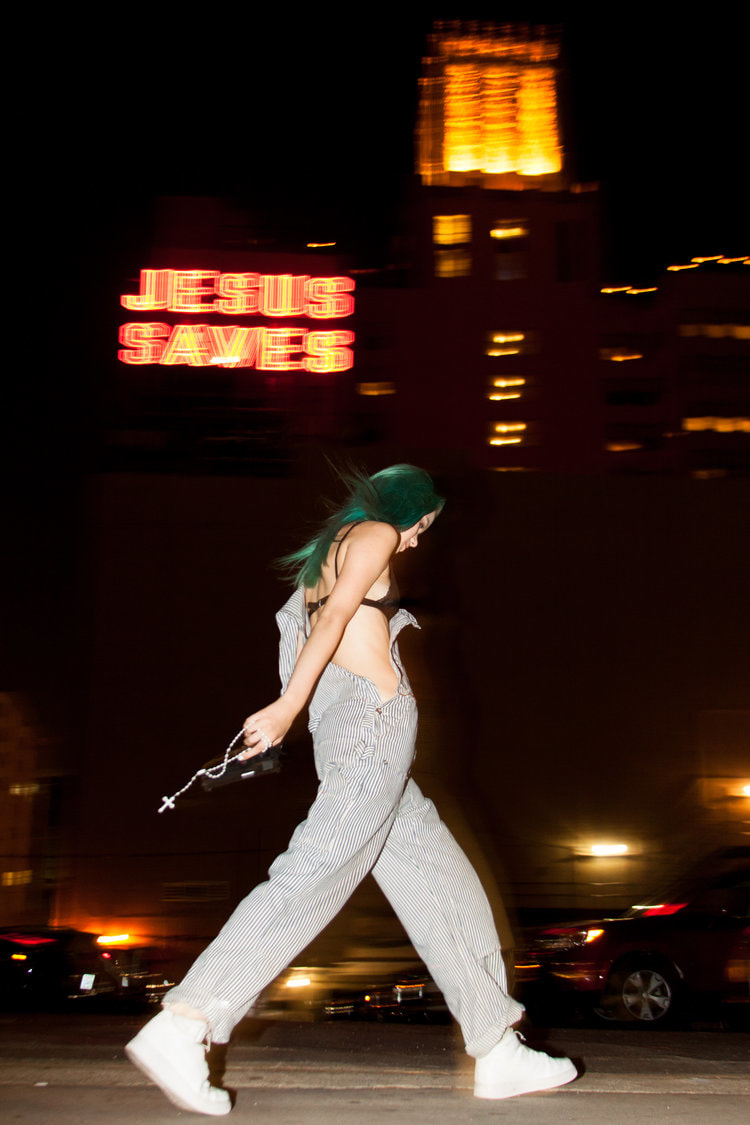
"NO VACANCY INN" is the creative lovechild of London raised DJ Acyde and New York native and creative consultant Tremaine Emroy. The duo spend their time flying all over the world hosting parties for brands and designing clothes for their own brand, aside from being involved in the party scene they act as consultants for household names such as Stussy, Frank Ocean and most recently they helped co-ordinate the release of Kanye Wests newest project "YE". The NO VACANY INN was established as the duo's attempt at re-creating the pre internet sensation of consuming culture from places such as record shops and vintage stores. After a few years the creative hub has positioned itself as the heart of culture in the digital age. For me both ACYDE and Emroy act as large inspirations when it comes to the way that they approach creativity, they both are so involved with street culture and art that just sticking to one form would be counter productive, this resinates with me a lot and has shown me that it isn't a bad thing to not stick to one art form. |
|
|
|
NICK WAPLINGTON
Waplington is a British artist based in London and New York, his career has spanned over 30 years initially starting as a photographer. In 2014 he became the first living British photographer to have a solo exhibition at the Tate, since then his artistic platform has expanded to paintings and drawings. Part of the reason why I am attracted to the artist is that he has been able to create a fluidity between all of his different interests resulting in him being able to literally create whatever he pleases. Each project that he has completed is almost entirely different to its predecessor, this type of versatility is proven in the contrasts between his project with the late and great Alexander McQueen where he acts as a documenter creating a a bank of pictures showing the creative process during the final show by McQueen and his project "The indecisive memento" which in many ways was an ode to Cartier Bresson's "The decisive moment". Waplington once stated that his practice is what ever he can do in the space of day, this resinated heavily with me. |
THRESHOLD CONCEPT
JAPANESE INSPIRED WORKS
|
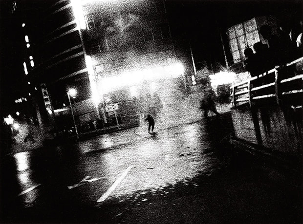
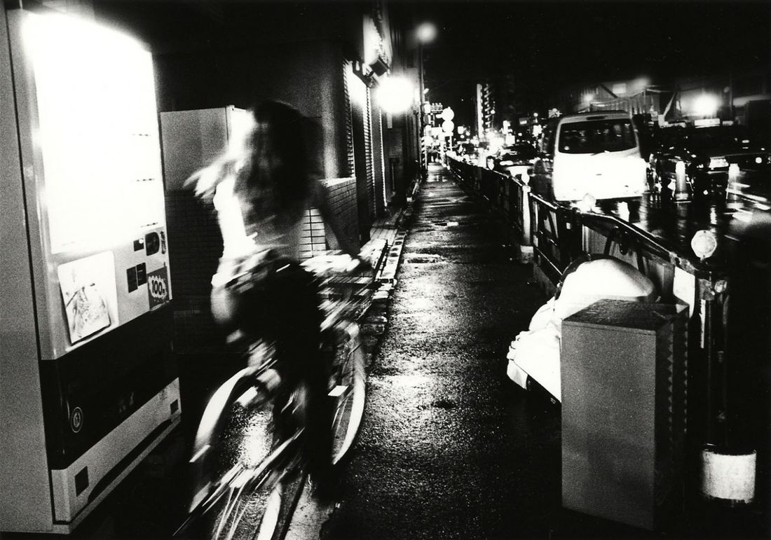
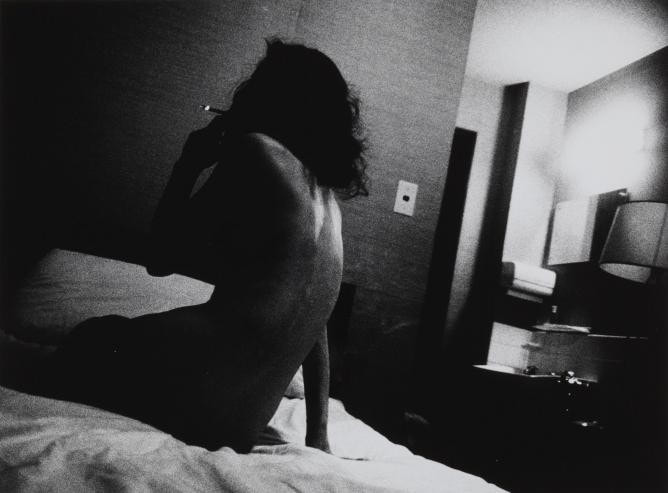
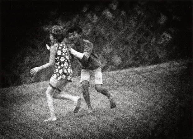
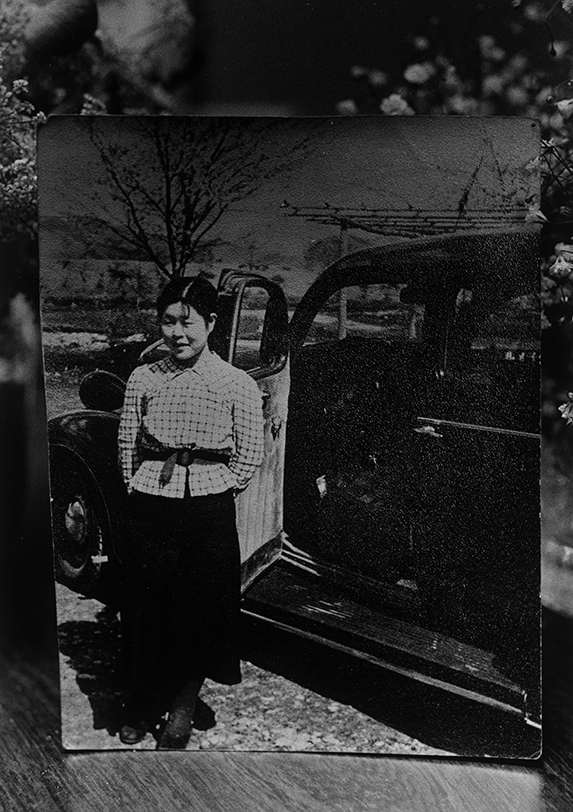
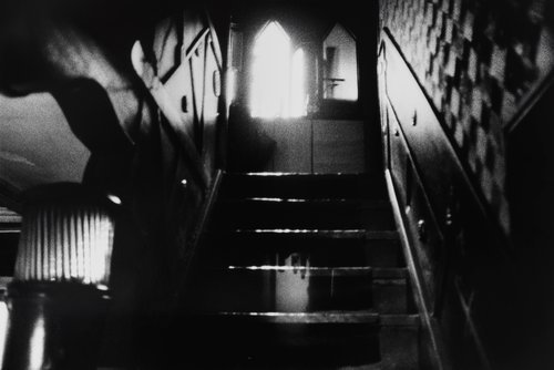
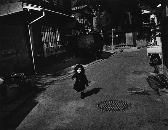
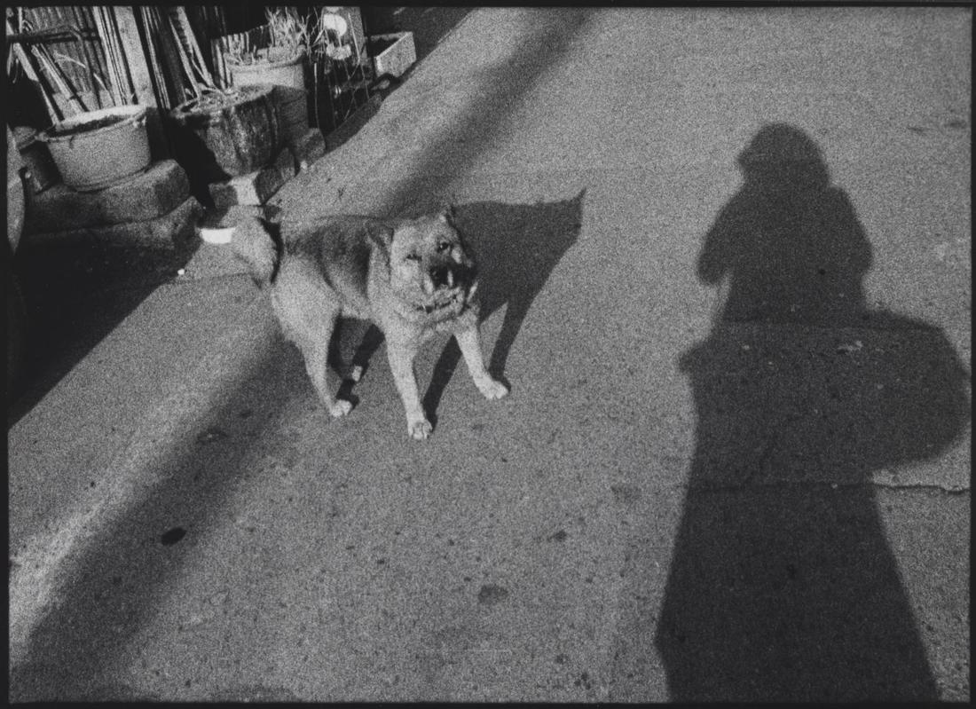
Over the summer and in recent months I have been experimenting with new processes inspired by the works of the Japanese abstract photographers such as Diado Moriyama and Miyako Ishiuchi. I was initially attracted to their works due to the raw and rough nature of the images. I read an article stating the influence of Moriyama's fascination with the dark underbelly of Tokyo, in his fifty year career his works have shaped the style of street photography.
The almost lo-fi and grainy black and white photographs paint a dark and moody image of a city often praised for its vibrancy and bright tone. This specific genre of Japanese photography was spawned in an attempt to explore the changing cultural traditions in a post war Japan. Ishiuchi approaches photography in a similar way, her photography is dark often with high contrasts creating a feeling of welcome change met with the natural feeling of nostalgia and a desire for past times. I wanted to expand my photographic styles past simple portraiture and documentation, I began my process by looking how I could translate the works of Moriyama into my photography, I used my phone as the camera and started to obscure the subjects by zooming in extremely close, to differentiate my experiments from the catalyst I took the photographs in colour, I also feel that by doing this I made the images personal to me (relating back to my interest in colour photography). I plan to continue this process using 35mm film, to truly capture my desired process in photography |
A selection of images by Diado Moriyama and Miyako Ishiuchi.
|
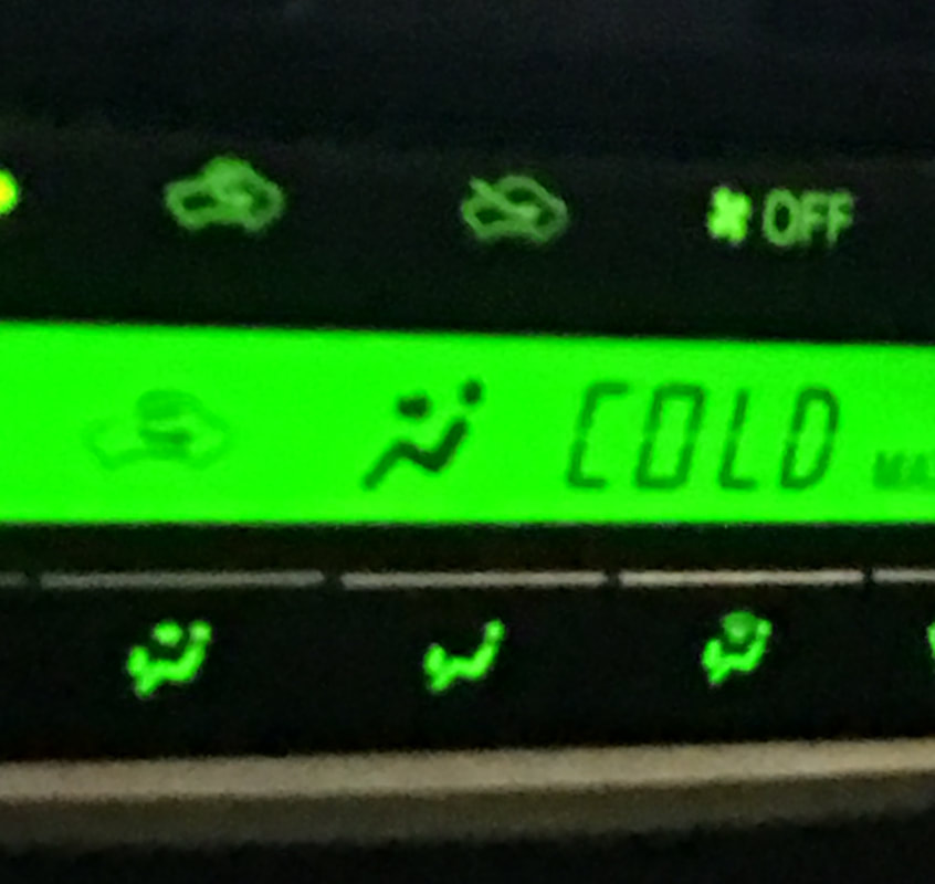
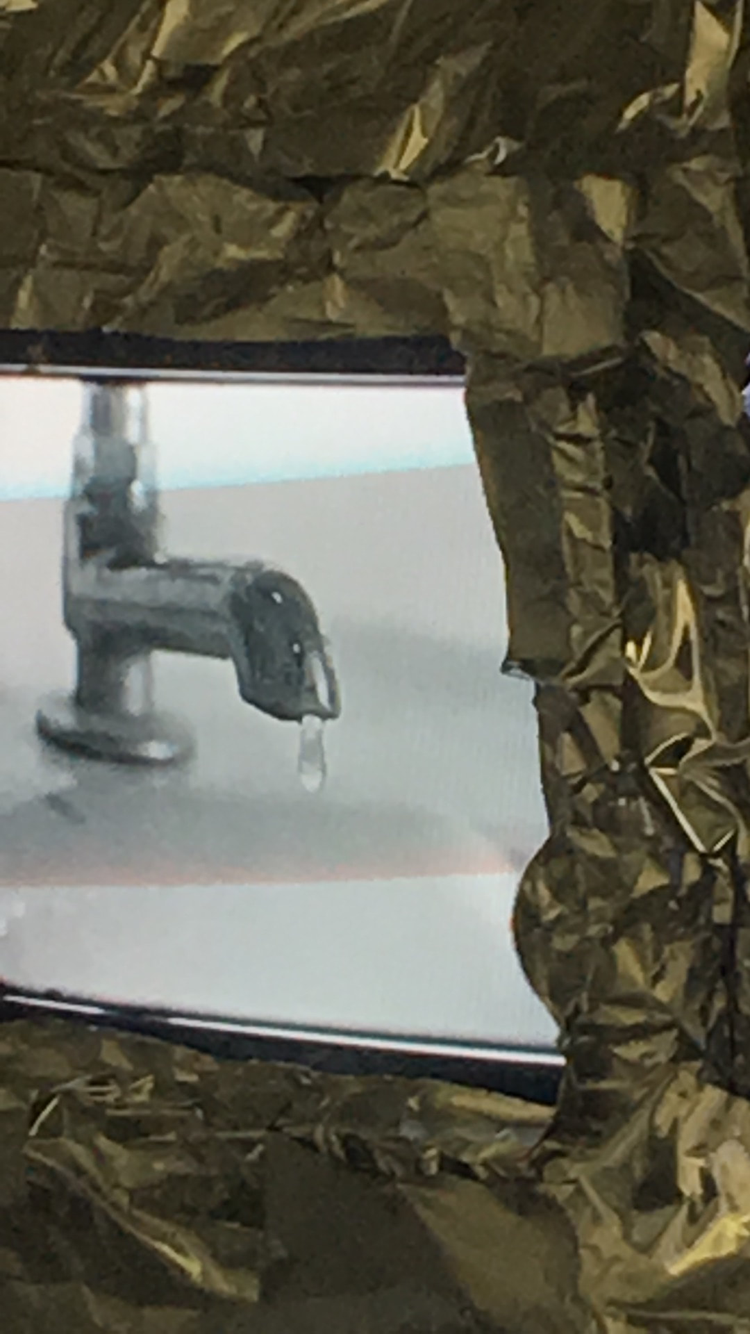

Whilst taking my images I chose to focus on how to effectively obscure a subject whilst still maintaining a core shape or colour, much like Moriyama's work I chose to observe subjects related to the theme of change, where he looked at cultural shifts I wanted to comment on shifts in form , an example of this in my work is the image showing a tap with dripping water, whilst the gold wrapping shown on the right hand side and the white background create a surreal and futuristic atmosphere the main focus (from my subjective view) is the tap and the falling droplet of water, the physical state of the water is changing, once it drips it is no longer merely a solo droplet it is part of a bigger pool of water. This idea of changing forms and physical states is shown through the image of the thermostat of a car, much like the image of the tap, this photograph creates a surreal feeling through the lucid green colour, in terms of a change in state the cars temperature is the main focus of the image.
|
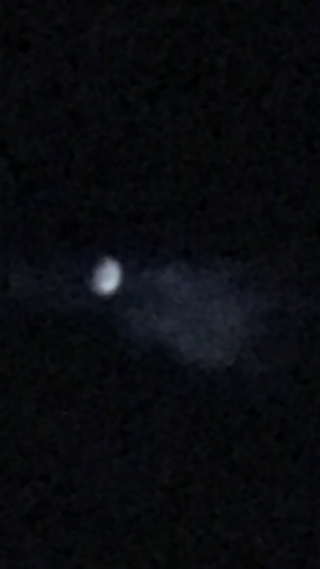
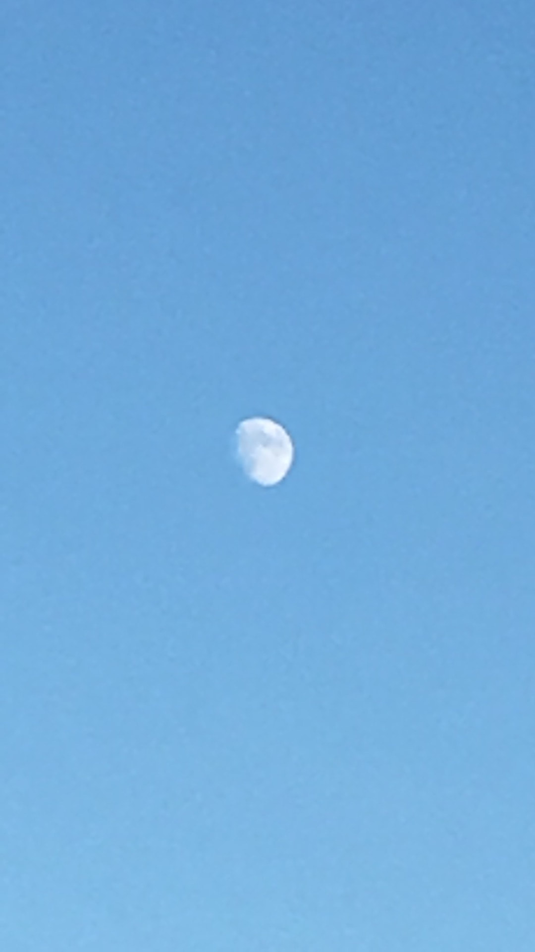
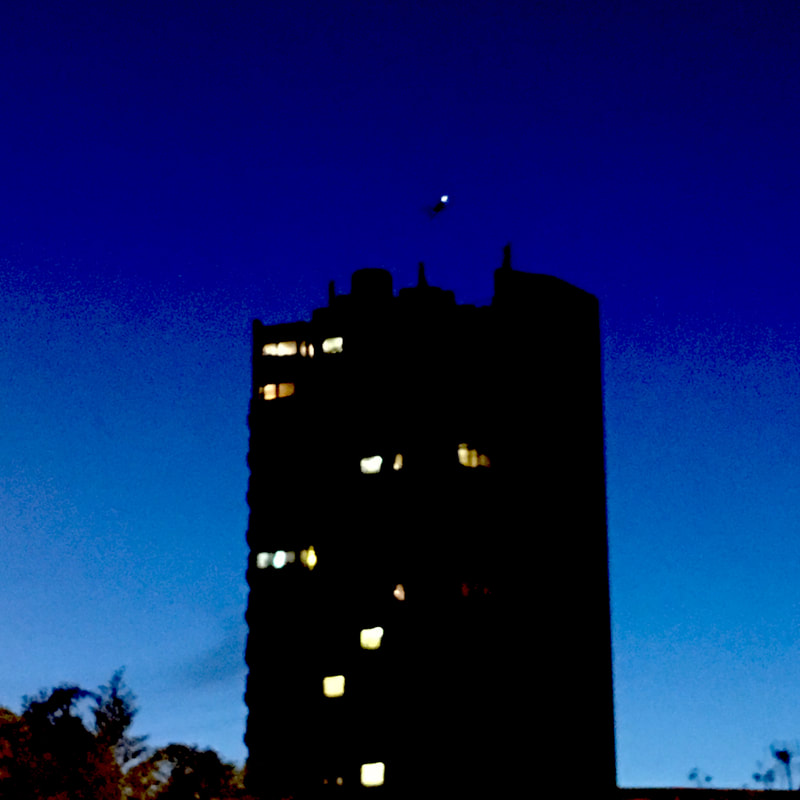
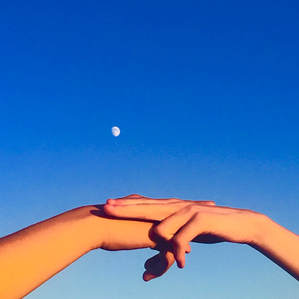
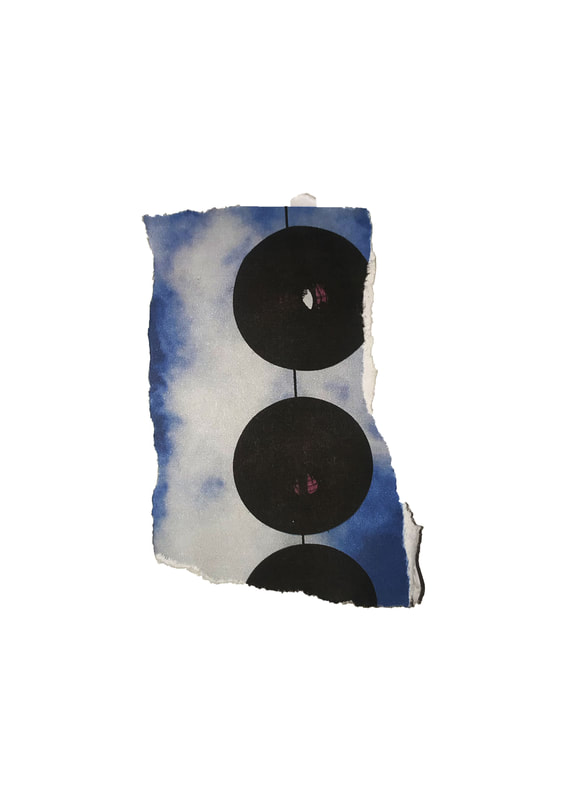
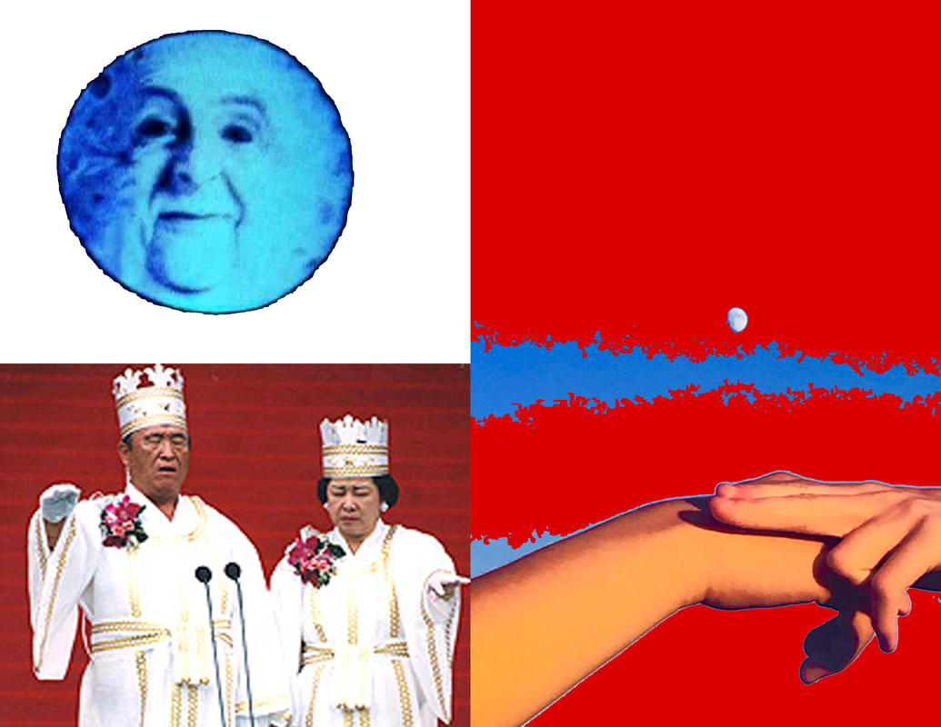
This is my favourite image out of the collection, aside from the purpose of this project the image is being used as the cover for my music groups upcoming album "Floating Minds". The colour gradient acts as the state change for the image, dark blue into light. The composition of the image also is a large factor in why this is my favourite from the set, the position of the handshake provides a balance between the colours. I edited the image in photoshop and enhanced the colours to create a waxy and euphoric feeling. |
COMPOSITION: I composed the image so that the moon would be placed slightly off centre whilst the hand shake is central in the frame, I wanted the picture to be a provider of catharsis and I feel I achieved this through the way the image is composed.
TEXTURE: After editing the already zoomed image the texture became even more grainy than before, the colour grading also becomes deeper due to the rough texture, this is most noticable in both the hands and in the centre of the sky.
COLOUR: In photoshop I altered the saturation and contrast levels creating a other worldly and surreal colour gradient in the sky, it fades from a deep royal blue into a soft baby blue, the hands also appear to be a variety of shades of red and orange, bellow the hands are faint shadows creating an outline effect.
FURTHER RESEARCH
In 2013 Diado Moriyama was involved in a joint exhibition at the Tate Modern with American abstract photographer William Klein, the show allowed both artists to present, compare and contrast their city centric photography.
William Klein was born on the 19th of April 1928 in New York to a Jewish family, Klein's work spanned across many creative paths from film to painting to photography.
In the same way as Moriyama's photographs capture a raw and realistic view of Tokyo, Klein made his name known by photographing the grit and grime of a 50's New York, as he grew older Klein migrated to Paris where he continued his photographic depictions of urban life for nearly 60 years. In interviews he has stated that his images capture everything he hated about America during that time period. His photobook "Life is good and good for you in New York" is the perfect example of his ability to capture a raw uncensored view of the working classes of the city, his black and white, abstract style is combined with his classic fashion photography.
|
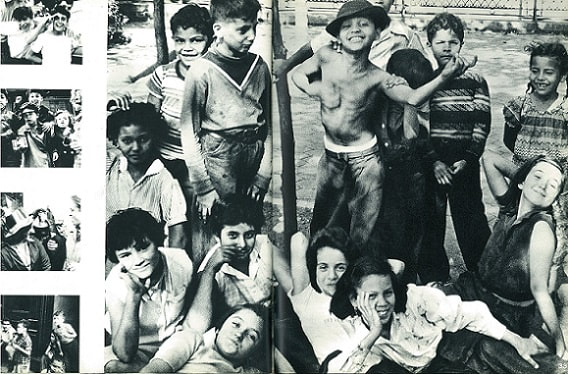
This image taken from Kleins's photobook "Life is good and good for you in New York", it shows a collection of young children gathered around a small tree.
The main focal point of the image is the shirtless boy sporting a hat in the middle of the image, his extended arm covers the face of a child behind him, surrounding him the majority of the children are smiling or striking poses apart from one boy to his left who appears to have been caught not paying attention and one boy to his right whose face is hidden by the central boy. The shadows caught in the photograph are deep blacks contrasted by the bright white school shirts sported by many of the children sitting around the bottom of the photograph. Klein's image shows an almost youthful excitement and innocence, the joyful expressions clearly depict this. |
An early idea for my final piece for my personal investigation is to create an exhibition here at school allowing me to convey the ideas of nostalgia through my photography for my final piece in this project. Along with the abstract and catharsis releasing imagery the show will be accompanied by a musical project that I am involved in. In recent months we have been working on our latest project "FLOATING MINDS", during this process we have focused on the ideas of nostalgia and catharsis as clear narrative points .
I previously stated at the start of the project that I want to be able to bring together both my loves for photography and my ever growing passion for music and through this concept I will be able to do it. Through both visual and sonic stimulation I feel like I will be able to create a very raw and nostalgic atmosphere.
I previously stated at the start of the project that I want to be able to bring together both my loves for photography and my ever growing passion for music and through this concept I will be able to do it. Through both visual and sonic stimulation I feel like I will be able to create a very raw and nostalgic atmosphere.
DENOTATION, CONNOTATION, STADIUM AND PUNCTUM
|
|
|
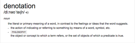
The concept of denotation in photography allows us to view an image purely at face value ; the subject of the photo is purely as it seems within the context of the image.
An image of a clown walking at face value is exactly as it seems without drawing connotations. 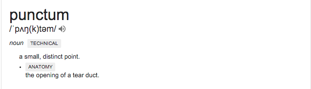
|
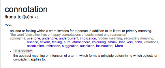
To draw connotations from an photograph you would have to look deeper than the pure face value of the subject.
Connotations may provide more social, cultural, historical or personal meaning to the photograph. |
The Punctum is sensation that one feels when seeing a certain photograph, Roland Barthes described the sensation as "the pricks or bruises" of the image, Punctum pushes the photograph past the levels of just Denotations.
The studium of the imaged is the general social contexts of what is seen within the image, where the punctum is one detail the studium acts as the full spectrum of what is seen within the image.
The studium of the imaged is the general social contexts of what is seen within the image, where the punctum is one detail the studium acts as the full spectrum of what is seen within the image.
MY IMAGE
|
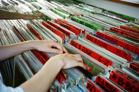
DENOTATION: The image shows three hands digging through crates of Jazz, Soul and Funk Vinyl records. The names of the genres are written on red and green cards.
CONNOTATION: To an observer the image could recall memories of listening to similar styles of music or in fact digging through stacks and stacks of Vinyl at a record shop. STADIUM: The Stadium of the image are the three pale arms and hands and the bright red and green labels scattered throughout the entirety of the image, the arms appear from the left hand side. PUNCTUM: The Punctum of the image is the written genres scribbled onto the red and green coloured cards. The genres could possibly bring about joyful and cathartic feelings for an observer allowing them to recall fond memories. |
|
POINT SUMMARY OF ROLAND BARTHE'S CAMERA LUCIDA
1) Exploring what photography is within itself
2) A search for an image that perfectly captures the essence of a person
3) Time can never be repeated, photographs capture what can't be physically replicated
4) A photograph is always invisible
5) As humans, once we see a lens we change how we act based off of instinct
6) A photograph creates whilst my body mortifies it
7) Cameras in short were clocks for seeing
8) I am neither subject nor object but a subject who feels he is becoming an object
9) The return of the dead
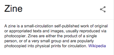
ZINE STUDY
|
For the last year and a half I have been creating small zines in and out of school, for the photo book element to the A-level course I created mock up zines showcasing my images in order before I actually got the book printed, I have predominantly have used my own images up and till now.
My most recent experiment saw me combine my photography with other interesting pieces like a word search. The result of the experiment was a zine titled "INERTIA", I chose this title because I feel as if it reflects the content perfectly, the idea of resisting change is something that I feel my generation claims to reject. |
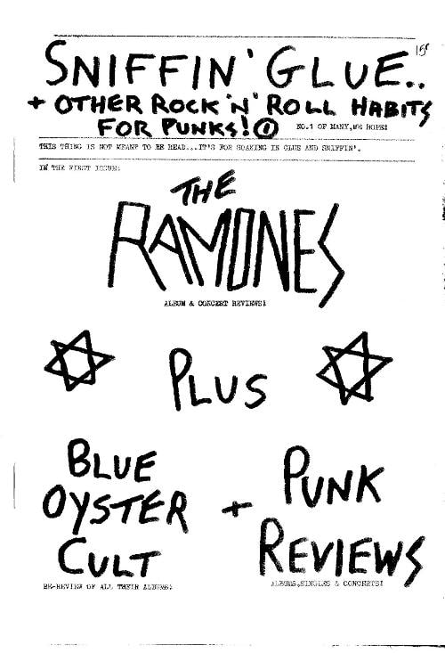
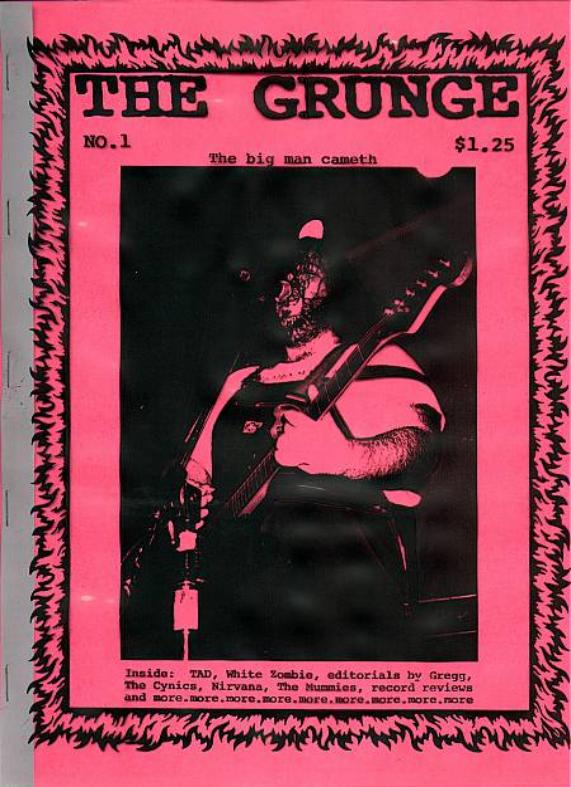
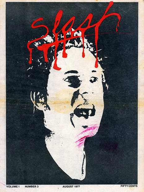
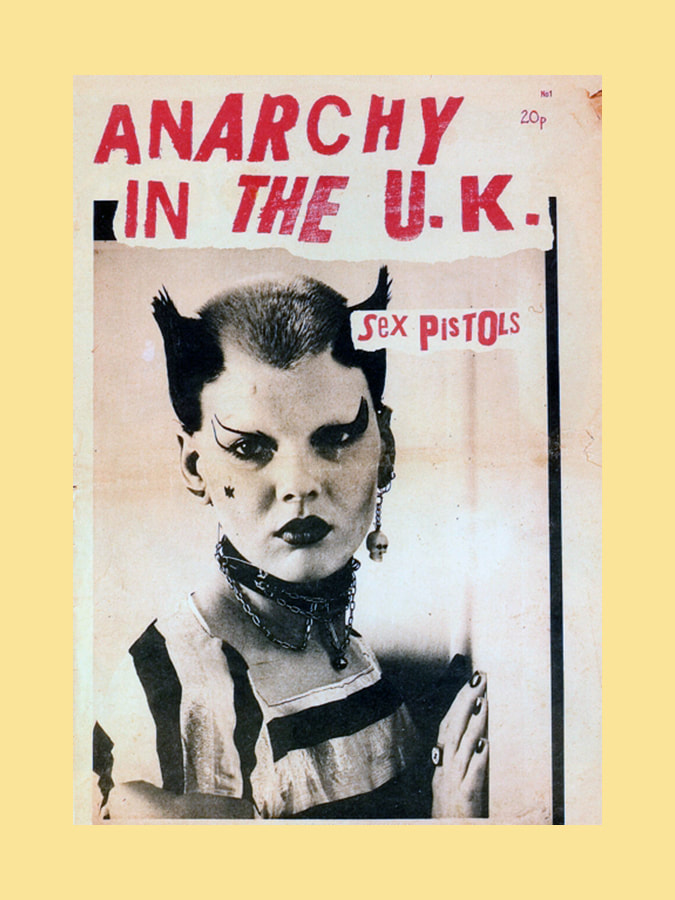
PUNK ZINES
The 1970's and 80's saw London and New York become hubs for the emerging underground punk scene, with this came a DIY renaissance of sorts. People began to create their own photo zines, the books often had the raw aesthetic that went hand in hand with the punk movement.
Early zines allowed new bands to be interviewed before they hit mainstream audiences, as the movement grew and began to become a contradiction of the morals early Punks embodied many of the zines decided to stop producing content.
Zines from different locations followed different bands, for example UK based Punk publications cover bands like The Sex Pistols, East Coast zines covered The Ramones, West coast followed bands such as Black Flag. The varied content in the zines allowed the community to spread all across the world.
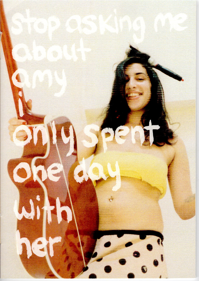
MODERN ZINE CULTURE
In a similar way to the 1970's and 80's, Zine making culture is used in 2018 as a way for creatives to showcase their works on a larger scale, the raw aesthetic of the punk era still remains important in the world of today. The rise of the internet era allows zine makers and artists to be able to sell their creations to people all over the world.
For me personally the process of making and designing a zine is a simple way of presenting work interestingly, it allows you to explore concepts and themes within your photography.
Jessica Haye & Clark Hsiao
|
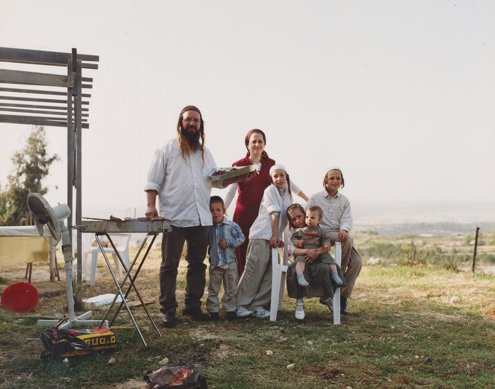
Jessica Haye and Clark Hsiao are photographers based in LA, the couple met whilst studying photography at the art centre college of design in Pasadena. The art produced by the collaboration often explores themes of intimacy and family life, they also shoot lookbooks and commercial campaigns.
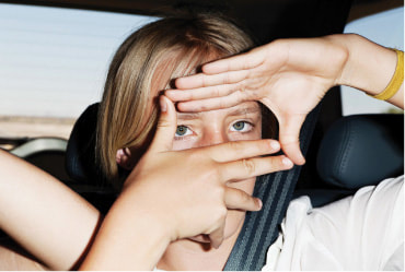
Haye and Hsiao's photography captures their family values and morals, a common factor within their images is that children will often be the subjects, this captures a certain innocence and lack of understanding of the world. The photograph embodies a child like innocence and carefree state of mind, many of these themes are explored through "Blonde". After doing some research I learned that the girl in the photograph was a family friend of Haye and Hsiao, she sat in the back of the family car on her way to visit her own late mothers memorial service. It becomes clear that due to her age she is unaware of the situation fully, overtime as she grows out of her youthful innocence . The image taken by Haye was credited as a creative stimulus for the 2016 Frank Ocean album "Blonde", after over year of writers block he was able to create an almost perfect album in response to the image. In a letter seen in his Boy's Don't Cry zine he speaks in detail about his connection to the image. |
|
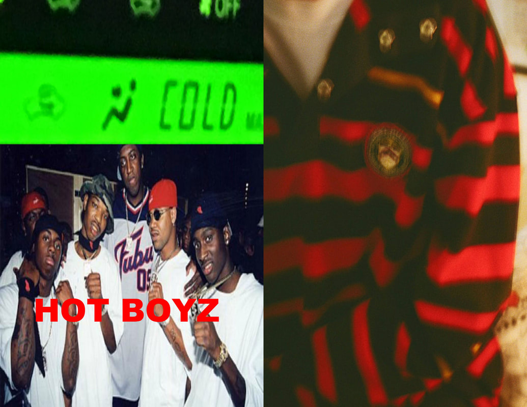
HOT MESS
|
|
"Hot Mess" is the creative lovechild of photographer and musician Noah Dillon and Model Luka Sabbat. Within the collective Dillon handles the photographic side of the project whilst Sabbat is the artist director. Since 2016 the duo have curated exhibitions in both Los Angeles and New York displaying their photography and installations. The duo first met online when Sabbat claimed to want to work with Dillon, the result of the collaboration is a collection of images and installations that often are fairly abstract in narrative and structure. |
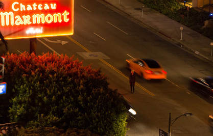
COMPOSITION
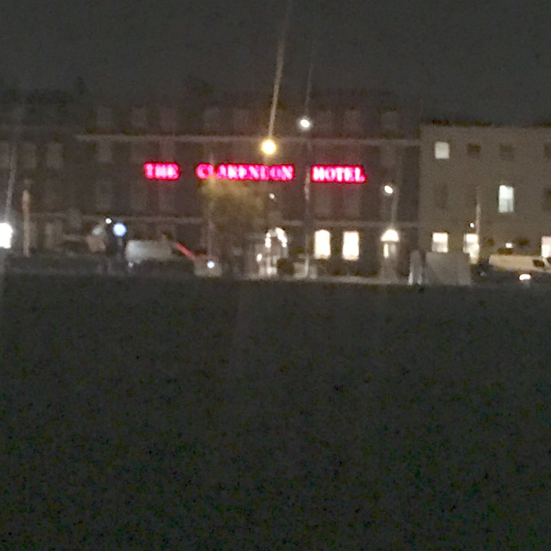
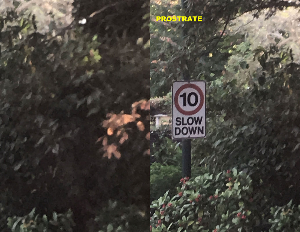
Taken from a high angle, capturing a motor way from above, like a cctv camera
The left side of the image shows a large green bush, the top half shows a brightly lit orange sign for a hotel, this side of the image is what initially catches ones eye first.
The middle and right hand side of the image is far more empty, orange and black sports cars appear to be speeding down the street, a blonde man is standing in the road, we can infer that he is crossing the street.
COLOUR
The photograph is dark in tone due to the time of day it was taken, however there are repeated flurries of orange scattered through out, this shown by the illuminated hotel sign and the lights at the back of the orange sports car.
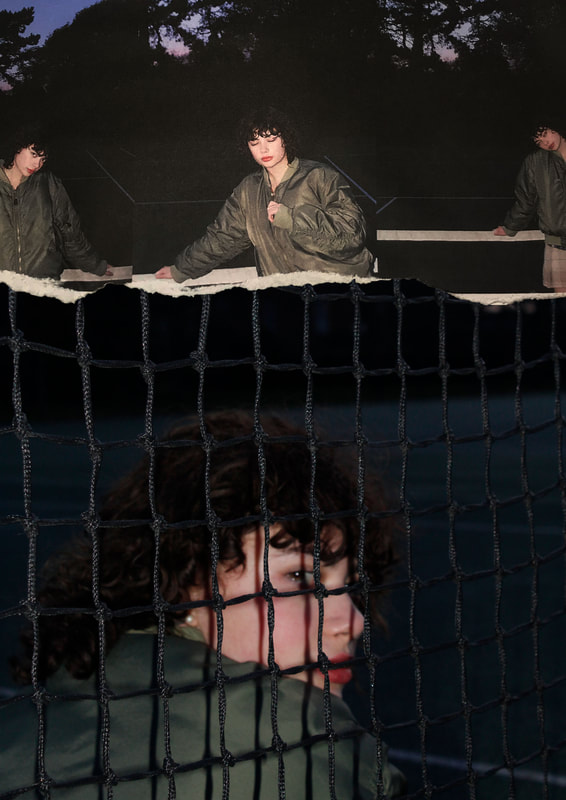
NOSTALGIA INSPIRED WORKS
Analysis
|
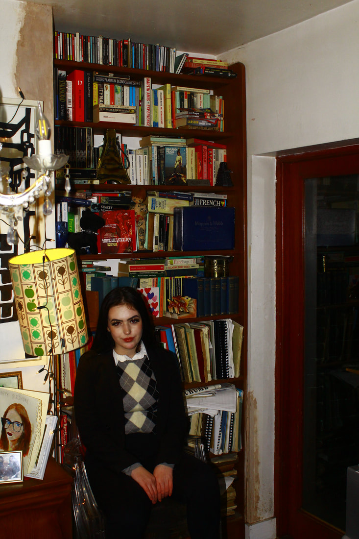
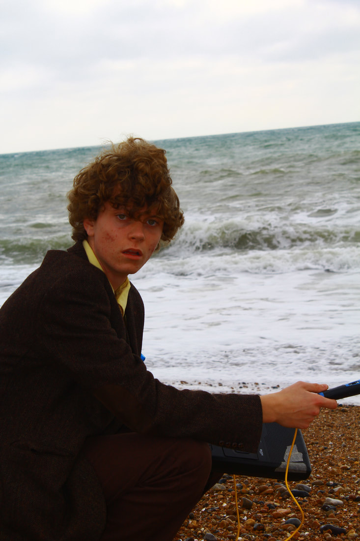
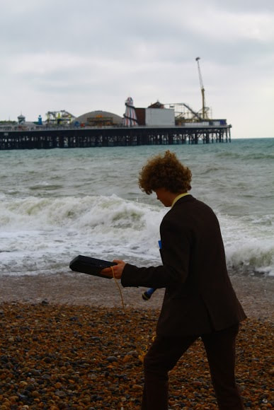
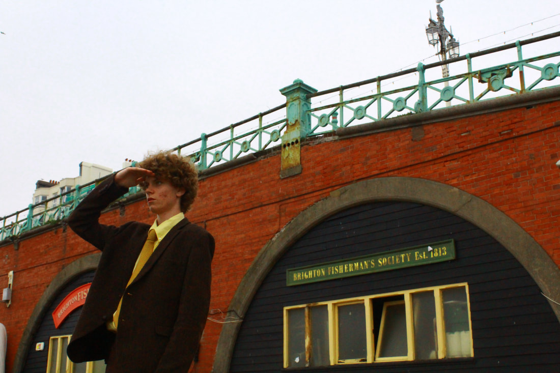
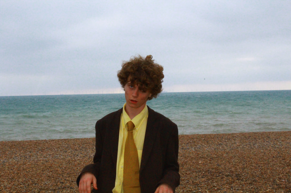
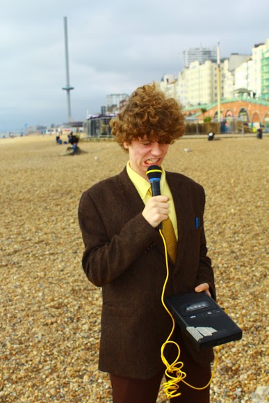
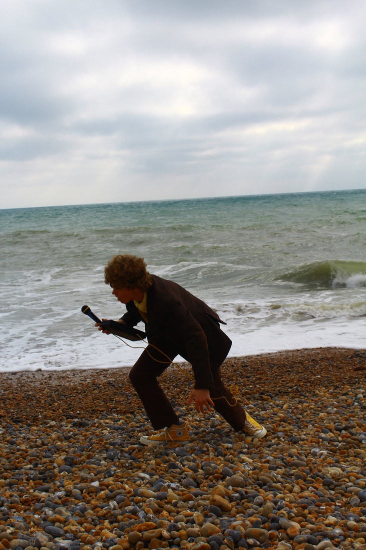
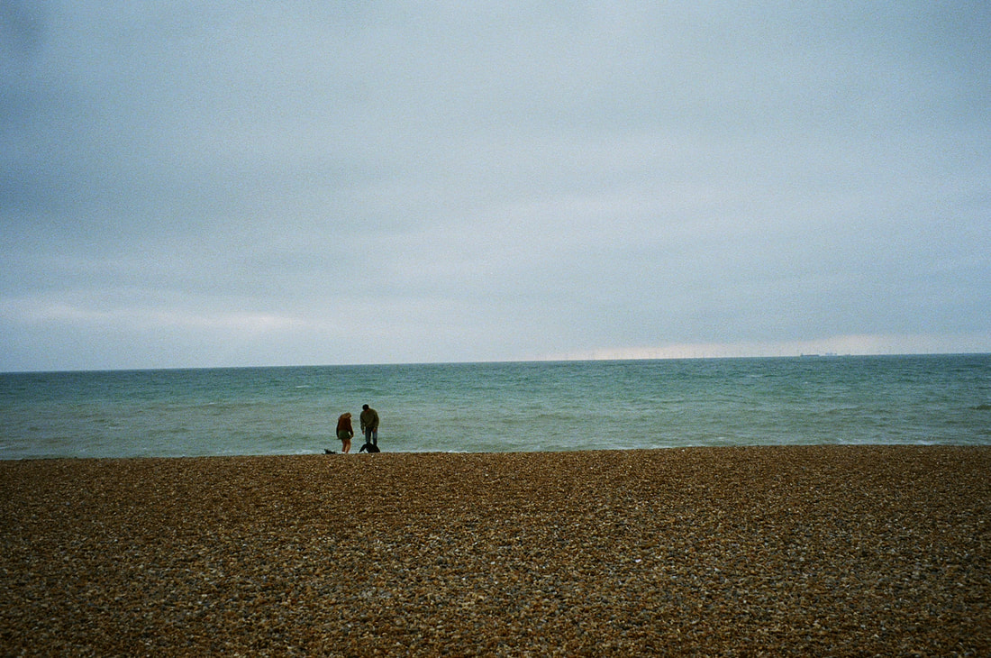
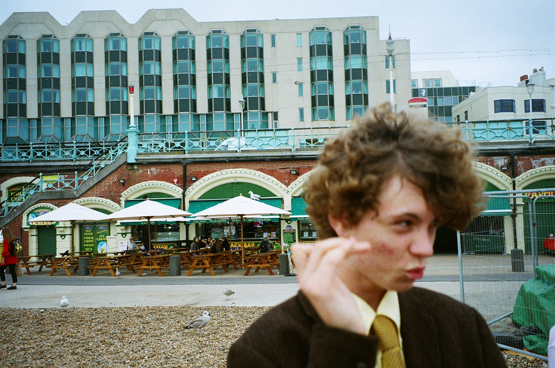
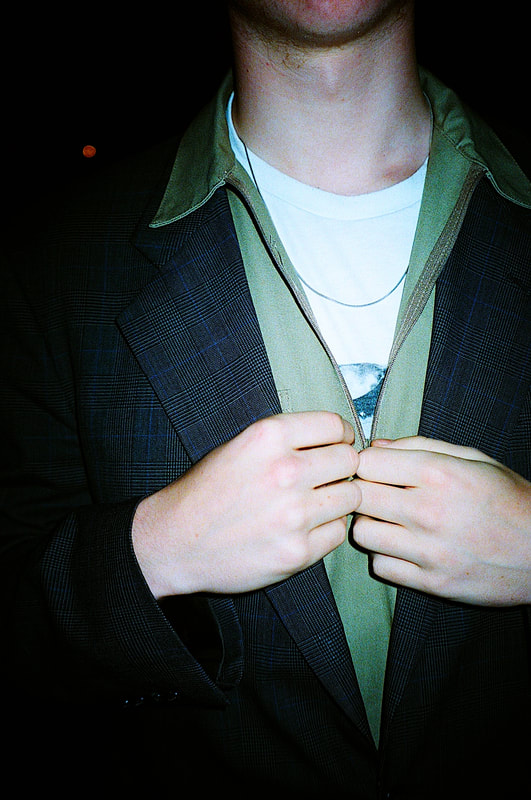
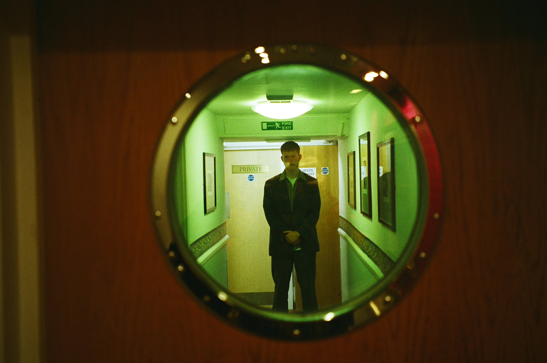
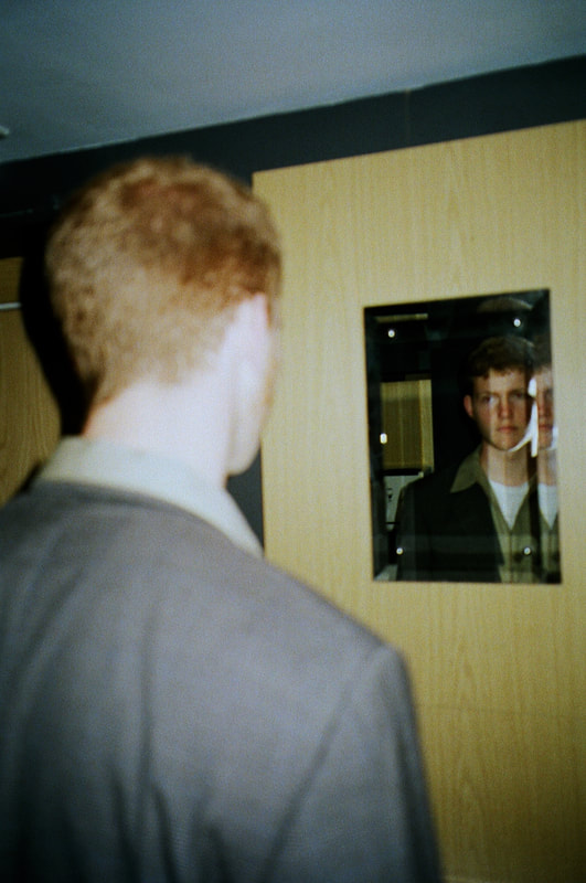
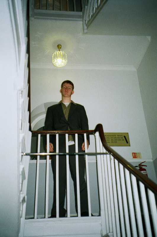
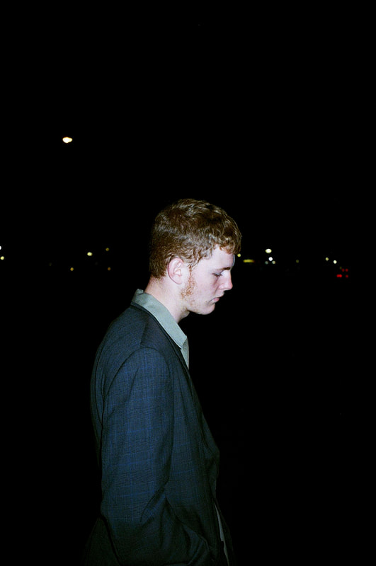
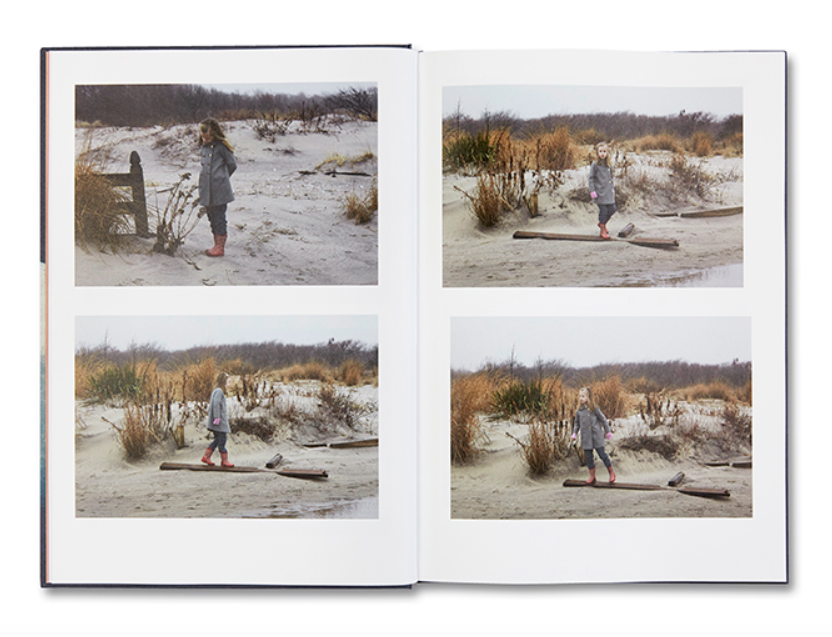
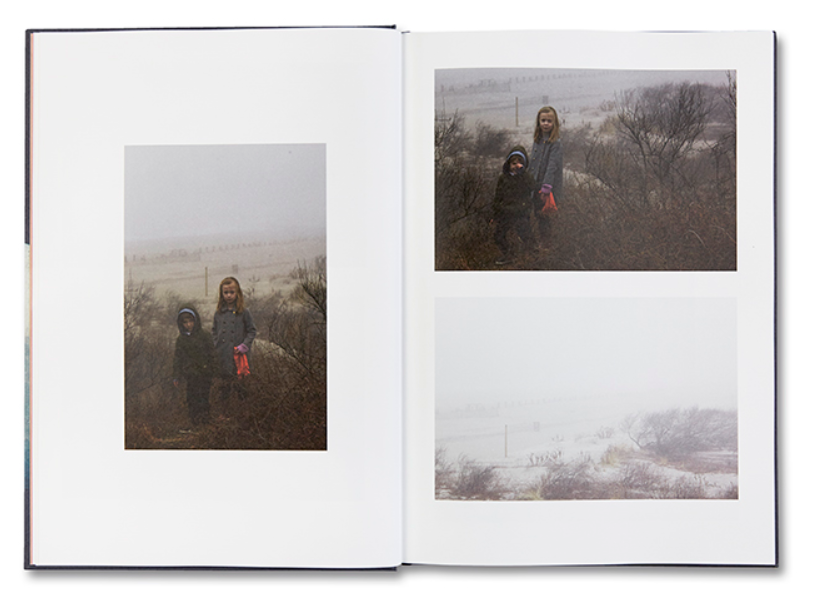
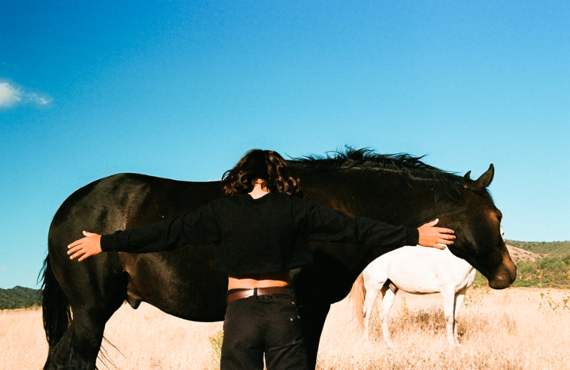
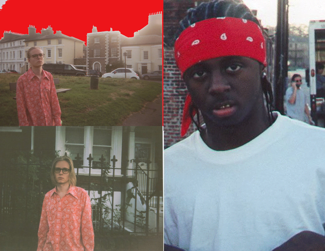
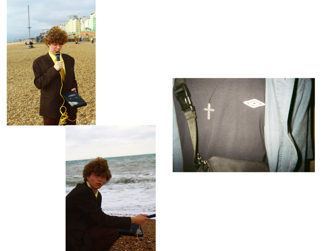
Whilst on our visit to the Brighton Photo bi-annual I decided to shoot images for my final project. The combination between the oversized suit and the beautiful beach perfectly captured the essence of my project.
My personal favourite image taken on the beach was a landscape shot in which the subject stood almost directly central in the frame. The background of the photograph captures multiple shades of blue across both the sea and the sky. The expression caught on the face of the subject presents an array of interpretable emotions, just by looking at him you could potentially see pain or confusion. |

|
ZINE 1 PAGES


ARTISTS TO RESEARCH
|
ROE ETHRIDGE "NEIGHBORS"
Ethridge's photo book "Neighbors" is a collection of the artists work spanning over 15 years, the style of the book captures both his conceptual and commercial works. The photographs often are deadpan, cold and candid reflections of American family life combined with both abstract iconography and farm animals. The book causes the mundane to appear as peculiar and unsettling, the subjects of the photographs are often friends or family of Ethridge tying back to the title of the project. Roe Ethridge has a portfolio of similar projects such as 2016's "Shelter Island". I was first drawn to the book because of the style in which the photographs were taken, I am greatly fascinated by the ideas of family that are explored within the book, the deadpan style of the photographs allows one to think back into their own lives to similar events. The combination of both original photography and found imagery also is a point of influence for me going into my personal project. |
|
|
Noah Dillion
Noah Dillion is a photographer and musician from Colorado most known for his part within the Hot Mess art collective. He personally defined his art as "Nature meets city. Isolation meets the antonym." He has been involved in commercial projects with fashion and sports brands such as Virgil Abloh's Off White as well as Nike and Northface. The photographs often take on a surreal approach towards typical fashion photography, visually the images are rich in colour, texture and concept, his most recent project follows him creating fake billboards for designer fashion brands and placing them in strange and obscure locations. |
|

|
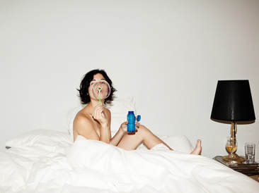
This was an image displayed during Dillion's first "HOT MESS" exhibition in New York. The image is seductive and surreal, I can infer that it was taken in a warm location, most likely Los Angeles due to Dillon often residing in the west coast city.
The model is positioned slightly off centre in the image, she is photographed wearing only underwear and a long black jacket, the colour of the clothing creates a disruption from the blue tinted white walls that take up the majority of space within the shot, a further disruption is the running Dog which moves from the right side of the image to the left. |
PIECE IDEA
The idea for my final piece for the second section of the personal investigation is to curate a multi media exhibit with a photobook and video. Within the book there will be both original and found images that follow the concept of finding nostalgia through the constant exposure that we experience in our everyday lives.
There is a clear divide between the types of images that I have begun to collect into my zines, some are clean and haven't been edited in any way whilst the remaining images are distorted and are often hard to entirely understand. Despite the contrasts in style the photographs that I have used merge together to build a body of work that represents that loose nature of our memory and how older images can trigger certain memories; the original images that show subjects in suits or work attire convey the social expectation of how we are expected to grow out of our pasts and into an adult world where they would be forced into nine to five jobs that they hate.
The video element of the project will follow the same idea as the book, I will continue to pair pop culture references with originally shot clips of skylines that aim to create a cathartic response from the audience. Along side the video will be an original score that I created using ambient synths and reverb heavy bell sounds.
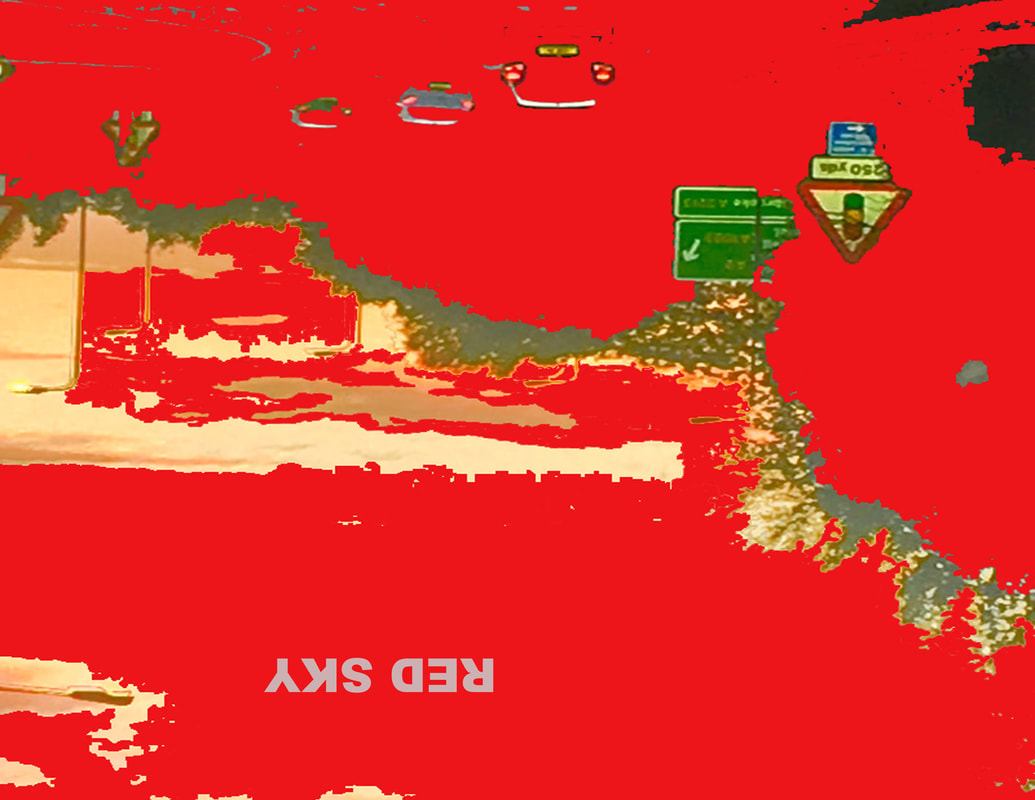
ZINE 1: RED SKY
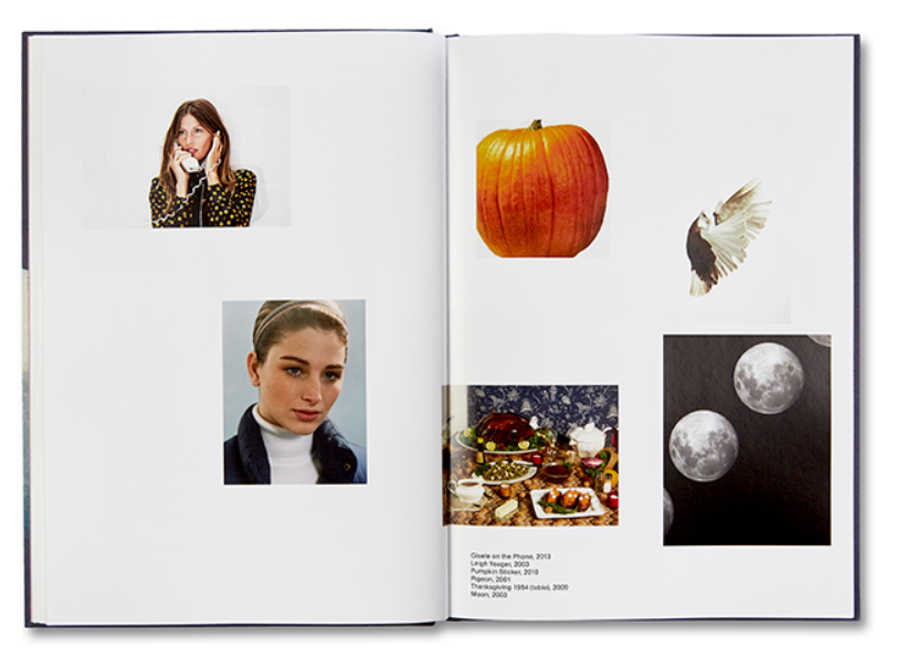
Through the first zine in the collection I want to establish the eclectic nature of the project, I paired my original photographs with found pop culture images that I feel tie together the abstract narrative.
A common factor from almost all of the pages is the use of red, in some cases the red was added in photoshop, by using the paint bucket tool I was able to create a distorted red wave.

|
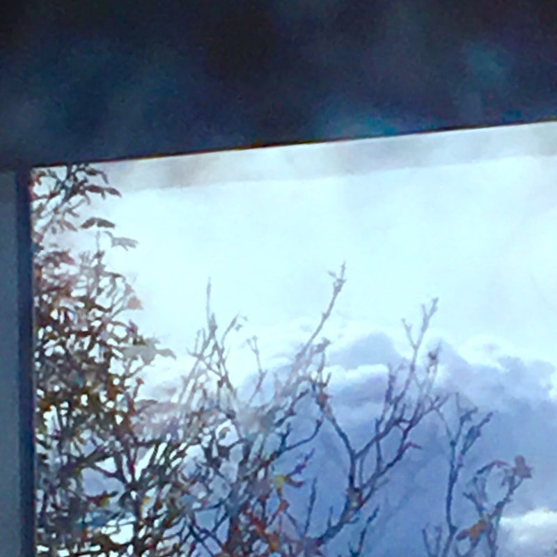
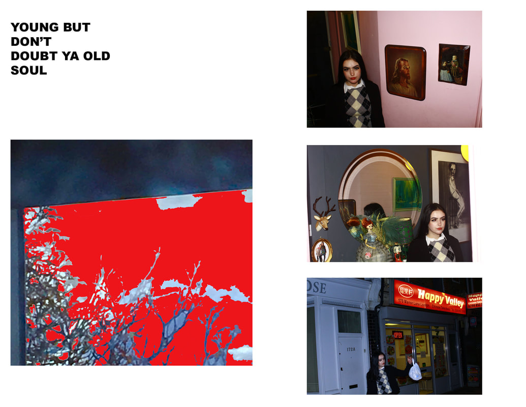
What can you see in this photograph? The image consists of two pages from the "Red Sky" zine. The left hand side shows an image of tree taken from behind a window, the pale grey sky is distorted by a wave of red that envelops the majority of the image. Above the image is a short statement. The right hand side of the page is built up of three images of a model posing in and around a surreal setting. She is wearing a work place attire, this ties in with one of the core narrative points of my project. |
|
ANTI ART
|
Andy Warhol (Burger)
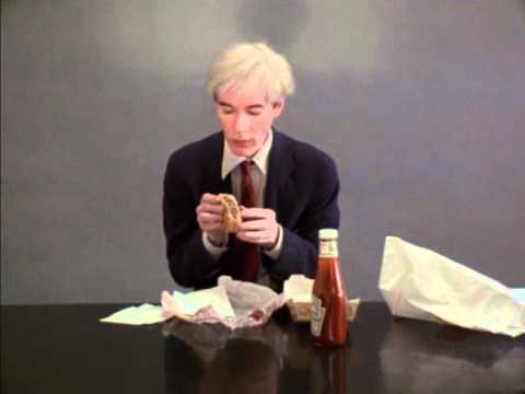
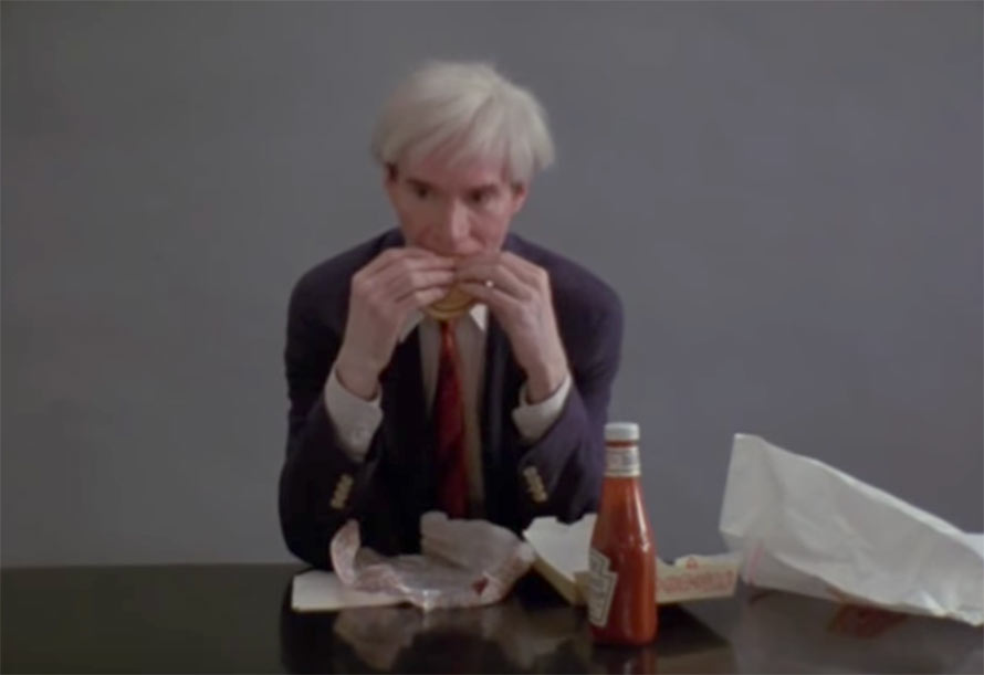
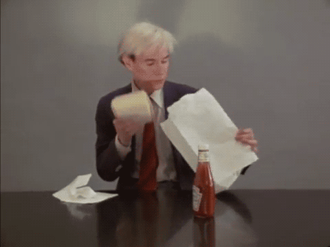
Initially, my exploration into the incorporation of the pop culture images was purely experimental and surface level, at the time I was focused purely on aesthetics and not on substance, however over time I began to think about how much of an impact advertising and “pop” culture has had on us as a society. I began to view my abduction of seemingly unrelated imagery in a similar way to how I interpreted the famous performance art piece by the late Andy Warhol where he is seen to simply eat a hamburger. To me the sarcastic yet genius video represents the consumeristic views of our Western society, my zines act almost as a guide through our culture of consumerism, predominantly the entertainment that we have the ability to consume through means such as the internet. |
|

"FROM THE HEART"
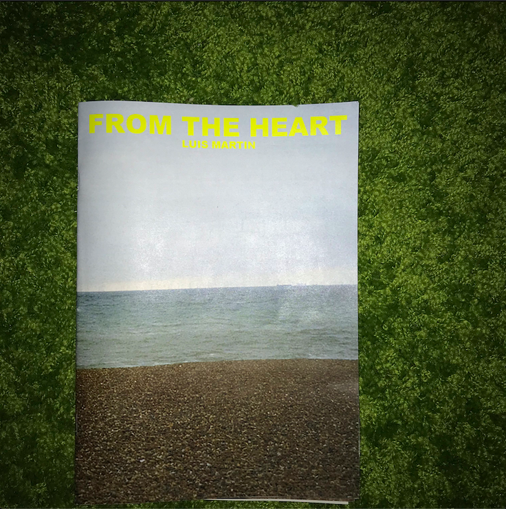
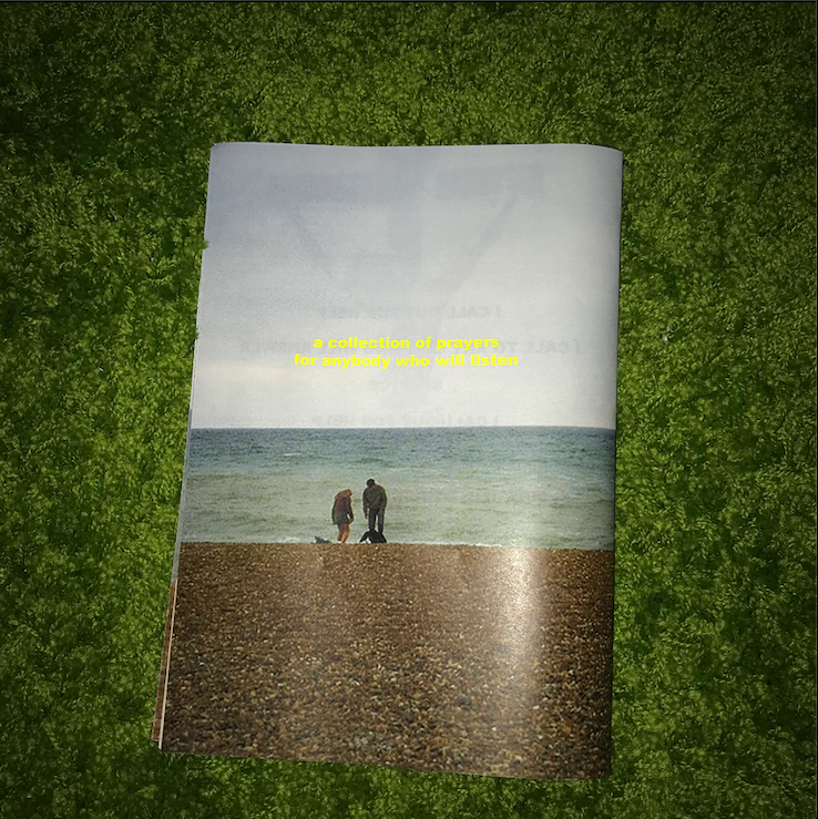
My final piece for my personal project was a multi media project following the idea of how we find nostalgia within our day to day lives through our constant exposure to advertising and capitalism. The first of the two parts of my project was a hand made fan zine exploring the key ideas of the project. I combined a selection of original images inspired by the works of Noah Dillon with a curation of found images spanning across different aspects of culture cinema (The shining) to religion.
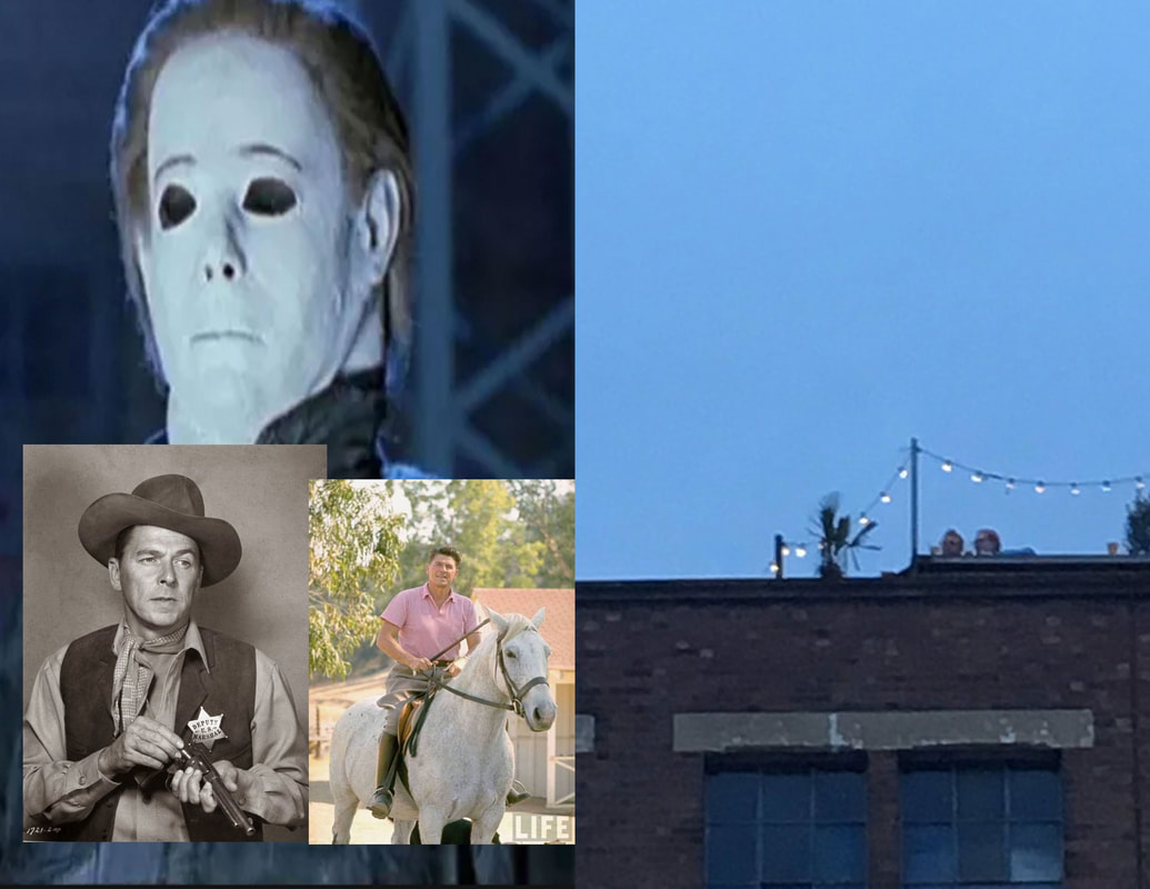
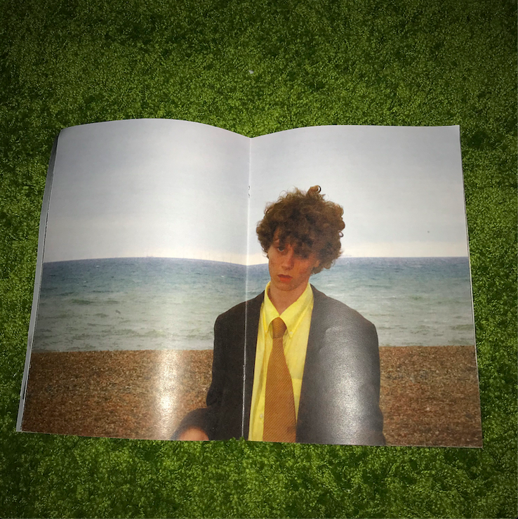
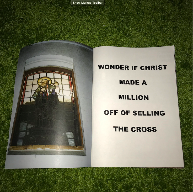
Through out the project I developed and explored the idea of how young people, especially creatives are expected to put their youthful years behind them and embark on a life of nine to five work, this is shown in my photographs on the models when they wear suits, I felt this motif was a perfect representation of this idea, the images of the people in suits also reflects the isolation that can be felt as a young creative in 2018 due to certain social expectations. I also chose to collect imagery from various different eras that I feel fit into the meaning of the project. An example of this is on the final two pages of the zine where I combined an image of Jesus Christ with a poem, the intention behind this set of imagery was for it to almost be treated as an advertising campaign, the idea of false advertising was inspired by the works of the Hot Mess collective who in 2018 curated a selection of billboards showing fake adverts for brands such as North Face and Celline.
The second element of my multi media project is a 3 minute short film in which I continued to explore the same themes and ideas that I began to look at in my zine. In the case of the film I used almost entirely found videos with the inclusion of three original clips. I carefully curated the video choosing to use specific clips that I feel either capture an essence of isolation and solitude or a look that would be nostalgic. Paired with the visual elements of the film I created an ambient score to compliment the abstract nature of the video.
INSTALLATION
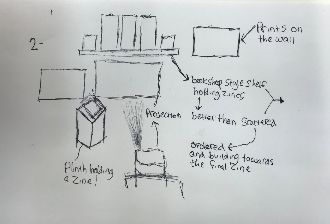
For my final outcome for my personal investigation I want to create an installation showcasing all of the aspects of my project. I began to think about the various different ways that I could create an outcome that would stick to the themes explored within the project one way or another. An early idea for the installation was to use a platform to hold an old tv playing my short film whilst images from the collections of zines are scattered around the back wall, bellow the TV on the floor would be the stack of various zines that I had made over the personal investigation.
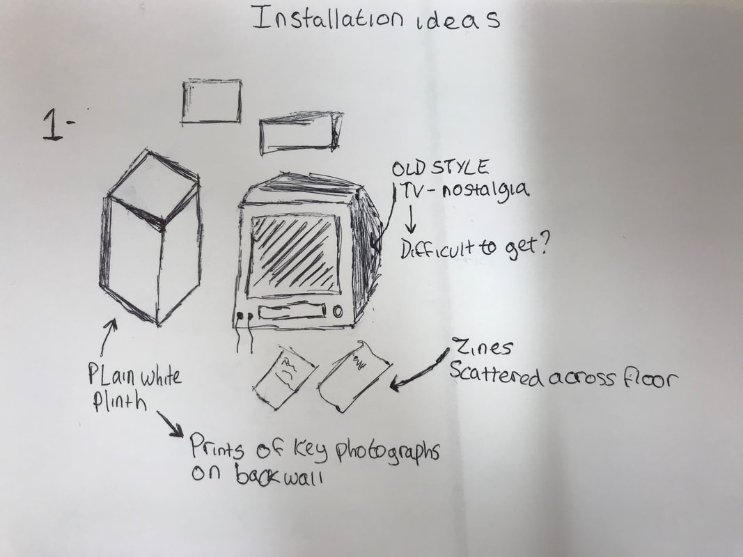
I realised that the idea of showing my short video on an old TV would be impractical, the process of first procuring it and then wiring it up to a laptop would be far too difficult and would act as a distraction from the rest of the end product.
My next idea was to play off of the amounts of zines that I had created, I wanted to use a shelf to showcase the progression across the whole of the project. Beneath the shelf would be a projection of my film on a white wall, I also wanted to continue to have the plinth involved in my installation.
My next idea was to play off of the amounts of zines that I had created, I wanted to use a shelf to showcase the progression across the whole of the project. Beneath the shelf would be a projection of my film on a white wall, I also wanted to continue to have the plinth involved in my installation.